
Cities are hotter than countrysides. That much was known long before efforts began to quantify the urban heat island (UHI) effect with data points.

The too-hot city is even a cultural trope. Films like “The Seven Year Itch” and “Do The Right Thing” use urban heat as a plot device that drives city-dwellers to decision. The Lovin’ Spoonful’s “Summer in the City” put the line “walking on the sidewalk, hotter than a match head” at the top of the Billboard Hot 100 for three weeks in August of 1966.
The lyric points to the primary reason for the heat discrepancies between cities and farms: Impervious surfaces. Grass is cooler than concrete, which is cooler than asphalt, and so on. Hundreds of miles of heat-trapping impervious surfaces trap and hold heat in urban centers, even overnight, and can push air temperatures several degrees higher than surrounding areas.
As cities grow and summers warm, mitigating the UHI effect – and the heat-related spikes in human health risk and energy use that accompany it – has crept steadily into conversations about urban planning.
Cities can plant trees and expand green spaces, paint roofs white to reflect (rather than trap) heat, or use lighter-colored building materials in new construction. But doing so, according to the UHI Program Director Victoria Ludwig of the EPA, “is all predicated on cities knowing that they have an urban heat island, knowing how bad it is, and knowing where it’s worst in the city so they can target interventions.”
The USGS Earth Resources Observation and Science (EROS) Center has long been a key part of those conversations, as it holds a vast archive of thermal data from the Landsat series of satellites. But it could soon play an even larger role.
As EROS data teams process, archive and distribute the increasingly sophisticated satellite data products used to study urban change, its science teams are using those products to fine-tune - and eventually automate - the complex and cost-prohibitive process of using it to identify urban hot zones.
The new approaches could prove a game-changer for UHI studies.
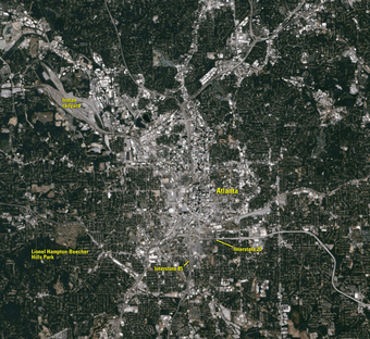
Research Physical Scientist George Xian of the USGS recently measured the UHI effect in the Atlanta Metropolitan Area using Landsat Analysis Ready Data (ARD)’s surface temperature product, a relatively new data stream that offers an enticing promise that static stations cannot: A heat signature for each 30-meter plot of ground in every major U.S. city, mapped year over year from 1985 through the present.
Cities could use such assessments to target their efforts more effectively. That’s one reason the EPA has moved to fold the emerging UHI data from EROS into an existing climate indicator that tracks urban heat waves. Instead of citywide figures, EPA would have block-by-block measurements to offer the public.
“This data would allow you say things like ‘this quadrant of Atlanta has warmed a lot more than this area over here during this time period,’” said Michael Kolian, an environmental scientist with EPA. “Adaptation and public health people want that super-resolved data. They don’t necessarily need it to know that it’s getting warmer – they want to know where.”
Detailed Temperature-Tracking: A Complex Endeavor
Scientific study of UHI is not a novel endeavor. British scientist Luke Howard documented differing temperatures between London and the surrounding areas between 1818 and 1820. The National Oceanic and Atmospheric Administration (NOAA) has factored UHI into climate calculations for decades.

Pinpointing hot spots, however, remains complex. Even the largest U.S. cities have only a handful of static climate stations – often located at airports on the outskirts of town, far from urban centers. One study saw researchers at the University of Wisconsin install 150 temperature and relative humidity sensors on utility poles in Madison to record data every 15 minutes – a costly process to start, costlier still to maintain and repeat.
Satellite data can be a powerful tool, but there are caveats. Landsat’s thermal bands can function like laser thermometers for the Earth’s surface, measuring heat at a far finer scale than static stations, but tall trees or buildings can throw off readings, and heavy clouds can cut off surface temperature readings altogether. And unlike always-on static stations, Landsat data comes once every eight days.
Cities hoping to tackle urban heat in the past have faced the time-consuming and expensive prospect of installing multiple weather stations, coupling the readings with satellite data to ferret out the details on hot spots, or devising alternative schemes.
“Some cities have used the Landsat images themselves and tried to interpret them, but for the most part over the past 10 or years or so, most cities have just focused on things like ‘okay, I know I need to plant trees, I know this section of the city is hotter, but which blocks would be best to plant them in so I can have the most impact?’” said Ludwig.
In the last few years, Ludwig has noticed what she describes as “more of a hyper-focus” on questions like “what blocks in our city are the hottest?”
“They really want to get down to that granular level,” she said. “It’s an equity issue for them, quite frankly. Cities are realizing that they know they have a heat island, they know in general that an area is hotter, but they also know they can’t plant trees everywhere. So they’re looking at Census tracts. They want to know where the heat is so they can overlay that with what they know about their vulnerable populations.”
Hot areas with greater density of low-income residents or elderly adults, for example, could become a priority for mitigation efforts. That spike in interest is part of the reason Ludwig’s program plans to add a page to its website to guide cities whose leaders have an interest in the details.
That’s where Xian’s work comes in. The researcher has previously produced Landsat-based UHI studies for Phoenix, AZ; Tampa, FL; and Las Vegas, NV.
Those assessments relied on both climate data and Landsat data, comparing one date in time to another to note differences. Xian’s recent assessment in Atlanta, however, was produced exclusively with satellite data, and covered a full year using all Landsat records.
What Xian found was that the Landsat-only model, run for 2018, returned temperature readings that tracked closely with climate stations. The assessment noted surface temperature differences of nine to 10 degrees between central Atlanta and rural areas.
Surface temperatures never match up exactly with air temperatures, which tend to be lower. And the data offered annual means, not day-by-day measurements. But the trendlines of the Landsat and on-the-ground data matched.
“We wanted to find where the hottest areas in that city are,” Xian said. “That’s exactly what we found.”
With the availability of Landsat ARD surface temperature products, which are built using the highest-quality Landsat scenes from 1985 through the present, Xian is now working to calculate more than 30 years’ worth of annual averages for the city, all measured at 30-meter resolution.
What’s more, Xian can couple those readings with land cover information from the EROS-produced National Land Cover Database (NLCD) and Land Change Monitoring, Assessment, and Projection (LCMAP) initiative to correlate heat signatures with urban growth and urban density.
“Our ultimate goal is to generate these sorts of monitoring capabilities for the nation. If we develop the algorithm from individual cities, we can implement the algorithm everywhere. We have enough ARD data and computing resources to do that,” Xian said.
Hot Spot Mapping Has Far-Reaching Value
The city-by-city look at hot spots has value that extends far beyond the mitigation efforts of individual cities, which are advised by the EPA to use surface and air temperatures to target their efforts.
Kevin Gallo is a NOAA scientist at EROS who has studied the UHI effect with satellite data for years and works alongside Xian on the ARD-based project.
NOAA’s interest in urbanization and the UHI is both historical and forward-looking. From a historical perspective, Gallo said, there is a need to account for the influence of urbanization on long-term climate records. Potential UHI and other influences are removed from those records at NOAA’s National Centers for Environmental Information through adjustments to data at suspect stations, based on data from nearby, uninfluenced stations.
From the forecasting perspective, NOAA’s National Weather Service (NWS) issues heat advisories and warnings every summer – warnings that could be more impactful for cities if coupled with satellite-derived, higher-resolution data on hot zones.
If certain parts of a city are consistently hotter, Gallo said, “those areas might be targeted for additional public notification.”
The EPA’s most immediate interest in the project is connected to climate indicators.
Kolian represents the EPA in the U.S. Global Change Research Program’s (USGCRP) interagency indicator workgroup. The interagency group’s climate indicators include air and sea surface temperatures, greenhouse gas emissions, Arctic sea ice extent, and phenological metrics like leaf bloom. The 16 indicators are foundational to the production of the Congressionally-mandated National Climate Assessments, the most recent of which was released last fall.
Each new data point helps improve public understanding of climate trends and forecasts, said Kolian.
“We’re always looking to add new ones, develop more of them, and look for more datasets,” said Kolian, who works with Xian within the interagency climate group.
The EPA produces a heat wave indicator for 50 U.S. cities, with heat waves measured by frequency and duration. Kolian’s interest was piqued when he learned that Xian had used Landsat data to look at heat trends in Atlanta neighborhoods.
“He was looking at Atlanta, and we had heat wave data for Atlanta. We started doing some comparisons, and it looked like the hot years that we had were matching up with his hot years,” Kolian said.
Moving forward, he said, the EPA’s hope is to incorporate the surface temperature data from EROS into the heat wave indicator.
“The data from Landsat is much more highly-resolved. It gives you a complete surface of the whole metropolitan area,” Kolian said. “We have our calculation based on one or two weather stations. But we’re interested in moving forward with the Landsat data coming online now for a deeper dive.”
The first step, of course, is to test and complete the algorithm. Xian and Gallo are currently working to validate the year-by-year results from Atlanta with NOAA climate station data, after which the results will be peer-reviewed and published.
Related

Landsat U.S. Analysis Ready Data Landsat U.S. Analysis Ready Data
Related