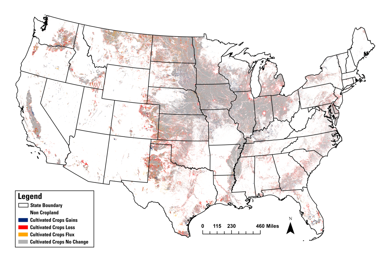
Cultivated crop changes from 1985-2023 (Annual NLCD)

Detailed Description
A map of cropland across the lower 48 states showing cropland gains, losses, flux, and stability (no change) from 1985 to 2023, calculated from the Annual National Land Cover Database (NLCD). The gray color represents stable cropland. The red are pixels that changed from cropland (loss). Blue represents areas that became cropland (gain). Orange shows areas in flux, that changed over time from cropland to grassland, typically, and then back to cropland again.
Sources/Usage
Public Domain.

