
Map of ANSS Stations

Detailed Description
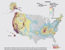
Map of ANSS free-field seismic stations across the U.S. in 2016 (not shown are additional seismic instruments in buildings and other structures). Map colors show seismic hazard across the United States derived from the National Seismic Hazard Model. Background colors indicate the levels of shaking that have a 2% chance of being exceed in a 50-year period. Shaking is expressed in a percentage of g, which is the acceleration of a falling object due to gravity, with red colors indicating highest shaking and thus higher hazard. Notice the greater density of stations in regions with either higher hazard, higher risk (e.g., southern California), or both.
Sources/Usage
Public Domain.
Public Domain