
Species richness heat map
By Climate Adaptation Science Centers
2018 (approx.)

Detailed Description
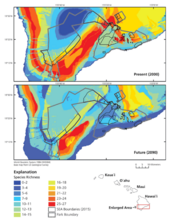
Native species richness (of the 29 species) using cool to warm colors to represent overlapping distributions of few to many species, respectively. The top panel shows that the present (year 2000) distribution of hotspots in the national park aligns well with the distribution of SEAs. As shown in the lower panel, projected species richness at the end of the century (year 2090) predominately contracts from the national park, resulting in few species hotspots within SEA boundaries. (Camp et al., 2018)
Sources/Usage
Camp et al., 2018