January to March 2026
Elmera Azadpour
Elmera Azadpour is a Data Scientist and Data Visualization Specialist for the USGS Water Resources Mission Area.
Elmera received a Master of Environmental Science and Management from the Bren School at the University of California, Santa Barbara. Her masters research examined optimal green infrastructure placements that reduce stormwater runoff pollution in Maunalua Bay, O‘ahu, Hawaiʻi. She received her Bachelor of Science in Environmental Biology from the University of Utah.
Science and Products
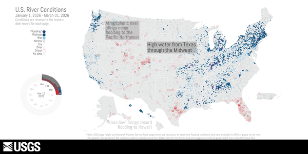 Thumbnail image for U.S. River Conditions, January to March 2026
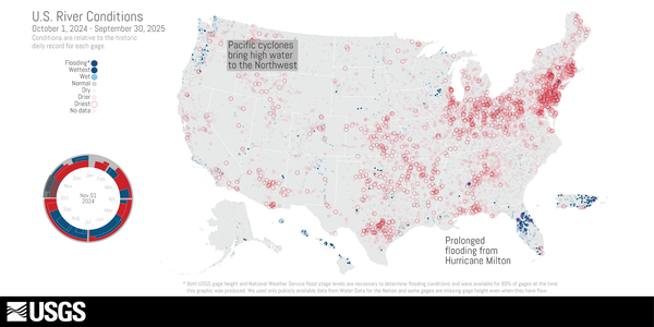
This is an animation showing the changing conditions relative to the historic record of USGS streamgages from October 1, 2024 - September 30, 2025. The river conditions shown range from the driest condition seen at a gage (red open circles) to the wettest (blue closed circles). A purple outer ring around a gage indicates it is flooding.
This is an animation showing the changing conditions relative to the historic record of USGS streamgages from October 1, 2024 - September 30, 2025. The river conditions shown range from the driest condition seen at a gage (red open circles) to the wettest (blue closed circles). A purple outer ring around a gage indicates it is flooding.
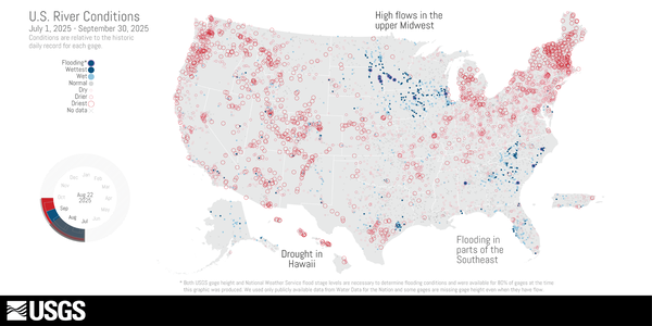
This is an animation showing the changing conditions relative to the historic record of USGS streamgages from July 1, 2025, to September 30, 2025. The river conditions shown range from the driest condition seen at a gage (red open circles) to the wettest (blue closed circles). A purple outer ring around a gage indicates it is flooding.
This is an animation showing the changing conditions relative to the historic record of USGS streamgages from July 1, 2025, to September 30, 2025. The river conditions shown range from the driest condition seen at a gage (red open circles) to the wettest (blue closed circles). A purple outer ring around a gage indicates it is flooding.
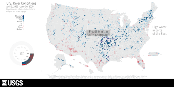
This is an animation showing the changing conditions relative to the historic record of USGS streamgages from April 1, 2025 to June 30, 2025. The river conditions shown range from the driest condition seen at a gage (red open circles) to the wettest (blue closed circles). A purple outer ring around a gage indicates it is flooding.
This is an animation showing the changing conditions relative to the historic record of USGS streamgages from April 1, 2025 to June 30, 2025. The river conditions shown range from the driest condition seen at a gage (red open circles) to the wettest (blue closed circles). A purple outer ring around a gage indicates it is flooding.
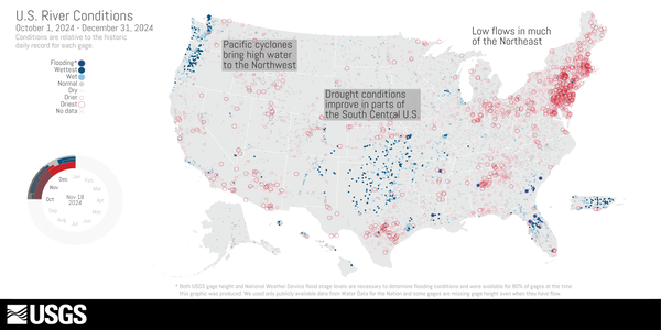
This is an animation showing the changing conditions relative to the historic record of USGS streamgages from October 1, 2024 to December 31, 2024. The river conditions shown range from the driest condition seen at a gage (red open circles) to the wettest (blue closed circles). A purple outer ring around a gage indicates it is flooding.
This is an animation showing the changing conditions relative to the historic record of USGS streamgages from October 1, 2024 to December 31, 2024. The river conditions shown range from the driest condition seen at a gage (red open circles) to the wettest (blue closed circles). A purple outer ring around a gage indicates it is flooding.
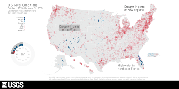 Map of U.S. River Conditions, October to December 2025
October to December 2025
 Thumbnail image for U.S. River Conditions for Water Year 2024
This is an animation showing the changing conditions relative to the historic record of USGS streamgages from October 1, 2023 - September 30, 2024. The river conditions shown range from the driest condition seen at a gage (red open circles) to the wettest (blue closed circles). A purple outer ring around a gage indicates it is flooding.
This is an animation showing the changing conditions relative to the historic record of USGS streamgages from October 1, 2023 - September 30, 2024. The river conditions shown range from the driest condition seen at a gage (red open circles) to the wettest (blue closed circles). A purple outer ring around a gage indicates it is flooding.
 Map showing U.S. River Conditions, July to September 2024
This is an animation showing the changing conditions relative to the historic record of USGS streamgages from July 1, 2024 to September 30, 2024. The river conditions shown range from the driest condition seen at a gage (red open circles) to the wettest (blue closed circles). A purple outer ring around a gage indicates it is flooding.
This is an animation showing the changing conditions relative to the historic record of USGS streamgages from July 1, 2024 to September 30, 2024. The river conditions shown range from the driest condition seen at a gage (red open circles) to the wettest (blue closed circles). A purple outer ring around a gage indicates it is flooding.
 U.S. River Conditions, April to June 2024 Thumbnail image shows a map of the U.S.
This is an animation showing the changing conditions relative to the historic record of USGS streamgages from April 1, 2024 to June 30, 2024. The river conditions shown range from the driest condition seen at a gage (red open circles) to the wettest (blue closed circles). A purple outer ring around a gage indicates it is flooding.
This is an animation showing the changing conditions relative to the historic record of USGS streamgages from April 1, 2024 to June 30, 2024. The river conditions shown range from the driest condition seen at a gage (red open circles) to the wettest (blue closed circles). A purple outer ring around a gage indicates it is flooding.
 Thumbnail of animation showing the changing conditions of USGS streamgages.
This is an animation showing the changing conditions relative to the historic record of USGS streamgages from January 1, 2024 to March 31, 2024. The river conditions shown range from the driest condition seen at a gage (red open circles) to the wettest (blue closed circles). A purple outer ring around a gage indicates it is flooding.
This is an animation showing the changing conditions relative to the historic record of USGS streamgages from January 1, 2024 to March 31, 2024. The river conditions shown range from the driest condition seen at a gage (red open circles) to the wettest (blue closed circles). A purple outer ring around a gage indicates it is flooding.
 U.S. River Conditions, October to December 2023 Thumbnail image shows a map of the US
This is an animation showing the changing conditions relative to the historic record of USGS streamgages from October 1, 2023 to December 31, 2023. The river conditions shown range from the driest condition seen at a gage (red open circles) to the wettest (blue closed circles). A purple outer ring around a gage indicates it is flooding.
This is an animation showing the changing conditions relative to the historic record of USGS streamgages from October 1, 2023 to December 31, 2023. The river conditions shown range from the driest condition seen at a gage (red open circles) to the wettest (blue closed circles). A purple outer ring around a gage indicates it is flooding.
 thumbnail image for the us river conditions animation for july through september 2023
This is an animation showing the changing conditions relative to the historic record of USGS streamgages from July 1, 2023 to September 30, 2023. The river conditions shown range from the driest condition seen at a gage (red open circles) to the wettest (blue closed circles). A purple outer ring around a gage indicates it is flooding.
This is an animation showing the changing conditions relative to the historic record of USGS streamgages from July 1, 2023 to September 30, 2023. The river conditions shown range from the driest condition seen at a gage (red open circles) to the wettest (blue closed circles). A purple outer ring around a gage indicates it is flooding.
This is an animation showing the changing conditions relative to the historic record of USGS streamgages from April 1, 2023 to June 30, 2023. The river conditions shown range from the driest condition seen at a gage (red open circles) to the wettest (blue closed circles). A purple outer ring around a gage indicates it is flooding.
This is an animation showing the changing conditions relative to the historic record of USGS streamgages from April 1, 2023 to June 30, 2023. The river conditions shown range from the driest condition seen at a gage (red open circles) to the wettest (blue closed circles). A purple outer ring around a gage indicates it is flooding.

Relationships: new tool - Split-panel map for inspecting timeseries images of Landsat and NLCD from 2001-2016 for Great Salt Lake
Relationships: new tool - Split-panel map for inspecting timeseries images of Landsat and NLCD from 2001-2016 for Great Salt LakeA split-panel map of Salt Lake City, Utah, highlighting the Great Salt Lake, shows 2006 Landsat imagery on the left side panel and 2006 NLCD, with colorized legend of land use classes, on the right. The animation displays a slider being used to switch between the two different datasets, revealing the land cover classes shown in Landsat imagery.

Uncertainties: trend - Change in forest area compared to 35-year mean (1985-2020)
Uncertainties: trend - Change in forest area compared to 35-year mean (1985-2020)A tile map of the U.S. with lollipop charts for each state that show differences in forest area magnitude, in squared kilometers, from the 35-year mean (1985-2020) across the contiguous United States (CONUS). Positive differences are shown in forest green lollipops and negative differences are shown in burnt orange lollipops.

Relationships: pop culture - Thirty years of daily average streamflow in cubic feet per second on the Rio Grande River, New Mexico, inspired by the style of a classic album cover
Relationships: pop culture - Thirty years of daily average streamflow in cubic feet per second on the Rio Grande River, New Mexico, inspired by the style of a classic album coverMean daily streamflow (cfs) of the Rio Grande at Embudo, New Mexico from 1991 to 2022. The chart has a black background and the 30 years of mean daily streamflow data are plotted as stacked white ridge lines that emulate the aesthetics of a classic rock album.
Relationships: pop culture - Thirty years of daily average streamflow in cubic feet per second on the Rio Grande River, New Mexico, inspired by the style of a classic album cover
Relationships: pop culture - Thirty years of daily average streamflow in cubic feet per second on the Rio Grande River, New Mexico, inspired by the style of a classic album coverRelationships: pop culture - Thirty years of daily average streamflow in cubic feet per second on the Rio Grande River, New Mexico, inspired by the style of a classic album cover
Relationships: pop culture - Thirty years of daily average streamflow in cubic feet per second on the Rio Grande River, New Mexico, inspired by the style of a classic album coverMean daily streamflow (cfs) of the Rio Grande at Embudo, New Mexico from 1991 to 2022. The chart has a black background and the 30 years of mean daily streamflow data are plotted as stacked white ridge lines that emulate the aesthetics of a classic rock album.
 Still of the video visualization of river conditions across the US from January to March 2023 as compared to historical
This is an animation showing the changing conditions relative to the historic record of USGS streamgages from January 1, 2023 to March 31, 2023. The river conditions shown range from the driest condition seen at a gage (red open circles) to the wettest (blue closed circles). A purple outer ring around a gage indicates it is flooding.
This is an animation showing the changing conditions relative to the historic record of USGS streamgages from January 1, 2023 to March 31, 2023. The river conditions shown range from the driest condition seen at a gage (red open circles) to the wettest (blue closed circles). A purple outer ring around a gage indicates it is flooding.
A tile map of the US showing streamgages by flow levels through the month of March 2023. For each state, an area chart shows the proportion of streamgages in wet, normal, or dry conditions. Streamflow conditions are quantified using percentiles comparing the past month’s flow levels to the historic record for each streamgage.
A tile map of the US showing streamgages by flow levels through the month of March 2023. For each state, an area chart shows the proportion of streamgages in wet, normal, or dry conditions. Streamflow conditions are quantified using percentiles comparing the past month’s flow levels to the historic record for each streamgage.

Comparisons: waffle - regional patterns of 4 common drinking water contaminants
Comparisons: waffle - regional patterns of 4 common drinking water contaminantsWaffle charts are colorized and faceted by contaminant (Pb, Fe, NO3-, and Sr) and region (West, Central, Midwest, East). Each 10 x 10 waffle charts shows the proportion of study area that contains high, moderate, and low concentrations where 1 square = 1 % of region. Figure contains callouts where, for example, NO3- in the Central U.S.
 Thumbnail of US river conditions oct 1 2022 to dec 31 2022
Video Description – October to December 2022
 Infographic still image of US River Conditions
U.S. River Conditions, October 2021 to September 2022
U.S. River Conditions, October 2021 to September 2022Video Description – Water Year: October 2021 to September 2022
U.S. River Conditions, October 2021 to September 2022
U.S. River Conditions, October 2021 to September 2022Video Description – Water Year: October 2021 to September 2022
Status of water-quality conditions in the United States, 2010–20 Status of water-quality conditions in the United States, 2010–20
Visualizations of water quality across the conterminous United States using SPARROW 2012 simulated nutrient load estimates Visualizations of water quality across the conterminous United States using SPARROW 2012 simulated nutrient load estimates
Evaluating high, moderate, and low concentrations of groundwater constituents across principal aquifer locations in the conterminous United States Evaluating high, moderate, and low concentrations of groundwater constituents across principal aquifer locations in the conterminous United States
Science and Products
 Thumbnail image for U.S. River Conditions, January to March 2026
January to March 2026
This is an animation showing the changing conditions relative to the historic record of USGS streamgages from October 1, 2024 - September 30, 2025. The river conditions shown range from the driest condition seen at a gage (red open circles) to the wettest (blue closed circles). A purple outer ring around a gage indicates it is flooding.
This is an animation showing the changing conditions relative to the historic record of USGS streamgages from October 1, 2024 - September 30, 2025. The river conditions shown range from the driest condition seen at a gage (red open circles) to the wettest (blue closed circles). A purple outer ring around a gage indicates it is flooding.
This is an animation showing the changing conditions relative to the historic record of USGS streamgages from July 1, 2025, to September 30, 2025. The river conditions shown range from the driest condition seen at a gage (red open circles) to the wettest (blue closed circles). A purple outer ring around a gage indicates it is flooding.
This is an animation showing the changing conditions relative to the historic record of USGS streamgages from July 1, 2025, to September 30, 2025. The river conditions shown range from the driest condition seen at a gage (red open circles) to the wettest (blue closed circles). A purple outer ring around a gage indicates it is flooding.
This is an animation showing the changing conditions relative to the historic record of USGS streamgages from April 1, 2025 to June 30, 2025. The river conditions shown range from the driest condition seen at a gage (red open circles) to the wettest (blue closed circles). A purple outer ring around a gage indicates it is flooding.
This is an animation showing the changing conditions relative to the historic record of USGS streamgages from April 1, 2025 to June 30, 2025. The river conditions shown range from the driest condition seen at a gage (red open circles) to the wettest (blue closed circles). A purple outer ring around a gage indicates it is flooding.
This is an animation showing the changing conditions relative to the historic record of USGS streamgages from October 1, 2024 to December 31, 2024. The river conditions shown range from the driest condition seen at a gage (red open circles) to the wettest (blue closed circles). A purple outer ring around a gage indicates it is flooding.
This is an animation showing the changing conditions relative to the historic record of USGS streamgages from October 1, 2024 to December 31, 2024. The river conditions shown range from the driest condition seen at a gage (red open circles) to the wettest (blue closed circles). A purple outer ring around a gage indicates it is flooding.
 Map of U.S. River Conditions, October to December 2025
October to December 2025
 Thumbnail image for U.S. River Conditions for Water Year 2024
This is an animation showing the changing conditions relative to the historic record of USGS streamgages from October 1, 2023 - September 30, 2024. The river conditions shown range from the driest condition seen at a gage (red open circles) to the wettest (blue closed circles). A purple outer ring around a gage indicates it is flooding.
This is an animation showing the changing conditions relative to the historic record of USGS streamgages from October 1, 2023 - September 30, 2024. The river conditions shown range from the driest condition seen at a gage (red open circles) to the wettest (blue closed circles). A purple outer ring around a gage indicates it is flooding.
 Map showing U.S. River Conditions, July to September 2024
This is an animation showing the changing conditions relative to the historic record of USGS streamgages from July 1, 2024 to September 30, 2024. The river conditions shown range from the driest condition seen at a gage (red open circles) to the wettest (blue closed circles). A purple outer ring around a gage indicates it is flooding.
This is an animation showing the changing conditions relative to the historic record of USGS streamgages from July 1, 2024 to September 30, 2024. The river conditions shown range from the driest condition seen at a gage (red open circles) to the wettest (blue closed circles). A purple outer ring around a gage indicates it is flooding.
 U.S. River Conditions, April to June 2024 Thumbnail image shows a map of the U.S.
This is an animation showing the changing conditions relative to the historic record of USGS streamgages from April 1, 2024 to June 30, 2024. The river conditions shown range from the driest condition seen at a gage (red open circles) to the wettest (blue closed circles). A purple outer ring around a gage indicates it is flooding.
This is an animation showing the changing conditions relative to the historic record of USGS streamgages from April 1, 2024 to June 30, 2024. The river conditions shown range from the driest condition seen at a gage (red open circles) to the wettest (blue closed circles). A purple outer ring around a gage indicates it is flooding.
 Thumbnail of animation showing the changing conditions of USGS streamgages.
This is an animation showing the changing conditions relative to the historic record of USGS streamgages from January 1, 2024 to March 31, 2024. The river conditions shown range from the driest condition seen at a gage (red open circles) to the wettest (blue closed circles). A purple outer ring around a gage indicates it is flooding.
This is an animation showing the changing conditions relative to the historic record of USGS streamgages from January 1, 2024 to March 31, 2024. The river conditions shown range from the driest condition seen at a gage (red open circles) to the wettest (blue closed circles). A purple outer ring around a gage indicates it is flooding.
 U.S. River Conditions, October to December 2023 Thumbnail image shows a map of the US
This is an animation showing the changing conditions relative to the historic record of USGS streamgages from October 1, 2023 to December 31, 2023. The river conditions shown range from the driest condition seen at a gage (red open circles) to the wettest (blue closed circles). A purple outer ring around a gage indicates it is flooding.
This is an animation showing the changing conditions relative to the historic record of USGS streamgages from October 1, 2023 to December 31, 2023. The river conditions shown range from the driest condition seen at a gage (red open circles) to the wettest (blue closed circles). A purple outer ring around a gage indicates it is flooding.
 thumbnail image for the us river conditions animation for july through september 2023
This is an animation showing the changing conditions relative to the historic record of USGS streamgages from July 1, 2023 to September 30, 2023. The river conditions shown range from the driest condition seen at a gage (red open circles) to the wettest (blue closed circles). A purple outer ring around a gage indicates it is flooding.
This is an animation showing the changing conditions relative to the historic record of USGS streamgages from July 1, 2023 to September 30, 2023. The river conditions shown range from the driest condition seen at a gage (red open circles) to the wettest (blue closed circles). A purple outer ring around a gage indicates it is flooding.
This is an animation showing the changing conditions relative to the historic record of USGS streamgages from April 1, 2023 to June 30, 2023. The river conditions shown range from the driest condition seen at a gage (red open circles) to the wettest (blue closed circles). A purple outer ring around a gage indicates it is flooding.
This is an animation showing the changing conditions relative to the historic record of USGS streamgages from April 1, 2023 to June 30, 2023. The river conditions shown range from the driest condition seen at a gage (red open circles) to the wettest (blue closed circles). A purple outer ring around a gage indicates it is flooding.

Relationships: new tool - Split-panel map for inspecting timeseries images of Landsat and NLCD from 2001-2016 for Great Salt Lake
Relationships: new tool - Split-panel map for inspecting timeseries images of Landsat and NLCD from 2001-2016 for Great Salt LakeA split-panel map of Salt Lake City, Utah, highlighting the Great Salt Lake, shows 2006 Landsat imagery on the left side panel and 2006 NLCD, with colorized legend of land use classes, on the right. The animation displays a slider being used to switch between the two different datasets, revealing the land cover classes shown in Landsat imagery.
Relationships: new tool - Split-panel map for inspecting timeseries images of Landsat and NLCD from 2001-2016 for Great Salt Lake
Relationships: new tool - Split-panel map for inspecting timeseries images of Landsat and NLCD from 2001-2016 for Great Salt LakeA split-panel map of Salt Lake City, Utah, highlighting the Great Salt Lake, shows 2006 Landsat imagery on the left side panel and 2006 NLCD, with colorized legend of land use classes, on the right. The animation displays a slider being used to switch between the two different datasets, revealing the land cover classes shown in Landsat imagery.

Uncertainties: trend - Change in forest area compared to 35-year mean (1985-2020)
Uncertainties: trend - Change in forest area compared to 35-year mean (1985-2020)A tile map of the U.S. with lollipop charts for each state that show differences in forest area magnitude, in squared kilometers, from the 35-year mean (1985-2020) across the contiguous United States (CONUS). Positive differences are shown in forest green lollipops and negative differences are shown in burnt orange lollipops.
Uncertainties: trend - Change in forest area compared to 35-year mean (1985-2020)
Uncertainties: trend - Change in forest area compared to 35-year mean (1985-2020)A tile map of the U.S. with lollipop charts for each state that show differences in forest area magnitude, in squared kilometers, from the 35-year mean (1985-2020) across the contiguous United States (CONUS). Positive differences are shown in forest green lollipops and negative differences are shown in burnt orange lollipops.

Relationships: pop culture - Thirty years of daily average streamflow in cubic feet per second on the Rio Grande River, New Mexico, inspired by the style of a classic album cover
Relationships: pop culture - Thirty years of daily average streamflow in cubic feet per second on the Rio Grande River, New Mexico, inspired by the style of a classic album coverMean daily streamflow (cfs) of the Rio Grande at Embudo, New Mexico from 1991 to 2022. The chart has a black background and the 30 years of mean daily streamflow data are plotted as stacked white ridge lines that emulate the aesthetics of a classic rock album.
Relationships: pop culture - Thirty years of daily average streamflow in cubic feet per second on the Rio Grande River, New Mexico, inspired by the style of a classic album cover
Relationships: pop culture - Thirty years of daily average streamflow in cubic feet per second on the Rio Grande River, New Mexico, inspired by the style of a classic album coverRelationships: pop culture - Thirty years of daily average streamflow in cubic feet per second on the Rio Grande River, New Mexico, inspired by the style of a classic album cover
Relationships: pop culture - Thirty years of daily average streamflow in cubic feet per second on the Rio Grande River, New Mexico, inspired by the style of a classic album coverMean daily streamflow (cfs) of the Rio Grande at Embudo, New Mexico from 1991 to 2022. The chart has a black background and the 30 years of mean daily streamflow data are plotted as stacked white ridge lines that emulate the aesthetics of a classic rock album.
 Still of the video visualization of river conditions across the US from January to March 2023 as compared to historical
This is an animation showing the changing conditions relative to the historic record of USGS streamgages from January 1, 2023 to March 31, 2023. The river conditions shown range from the driest condition seen at a gage (red open circles) to the wettest (blue closed circles). A purple outer ring around a gage indicates it is flooding.
This is an animation showing the changing conditions relative to the historic record of USGS streamgages from January 1, 2023 to March 31, 2023. The river conditions shown range from the driest condition seen at a gage (red open circles) to the wettest (blue closed circles). A purple outer ring around a gage indicates it is flooding.
A tile map of the US showing streamgages by flow levels through the month of March 2023. For each state, an area chart shows the proportion of streamgages in wet, normal, or dry conditions. Streamflow conditions are quantified using percentiles comparing the past month’s flow levels to the historic record for each streamgage.
A tile map of the US showing streamgages by flow levels through the month of March 2023. For each state, an area chart shows the proportion of streamgages in wet, normal, or dry conditions. Streamflow conditions are quantified using percentiles comparing the past month’s flow levels to the historic record for each streamgage.

Comparisons: waffle - regional patterns of 4 common drinking water contaminants
Comparisons: waffle - regional patterns of 4 common drinking water contaminantsWaffle charts are colorized and faceted by contaminant (Pb, Fe, NO3-, and Sr) and region (West, Central, Midwest, East). Each 10 x 10 waffle charts shows the proportion of study area that contains high, moderate, and low concentrations where 1 square = 1 % of region. Figure contains callouts where, for example, NO3- in the Central U.S.
Comparisons: waffle - regional patterns of 4 common drinking water contaminants
Comparisons: waffle - regional patterns of 4 common drinking water contaminantsWaffle charts are colorized and faceted by contaminant (Pb, Fe, NO3-, and Sr) and region (West, Central, Midwest, East). Each 10 x 10 waffle charts shows the proportion of study area that contains high, moderate, and low concentrations where 1 square = 1 % of region. Figure contains callouts where, for example, NO3- in the Central U.S.
 Thumbnail of US river conditions oct 1 2022 to dec 31 2022
Video Description – October to December 2022
 Infographic still image of US River Conditions
U.S. River Conditions, October 2021 to September 2022
U.S. River Conditions, October 2021 to September 2022Video Description – Water Year: October 2021 to September 2022
U.S. River Conditions, October 2021 to September 2022
U.S. River Conditions, October 2021 to September 2022Video Description – Water Year: October 2021 to September 2022


