
Legacy Products
This page provides a summary of previous versions of the project’s forecast products. These products are no longer produced operationally and are left on this website as information only. Further detail on these versions can be found on the Publications page.
Legacy Fire Potential Index Mapping
The Fire Potential Index (FPI) is a moisture-based vegetation flammability indicator. It is a function of current living vegetation greenness as a proportion of maximum greenness. It is also a function of current 10-h dead fuel moisture as a proportion of the moisture of extinction. Thus the FPI is high when the living vegetation is mostly or completely cured and the 10-h dead fuel moisture is low. The FPI is low when the living vegetation is near fully green and the 10-h moisture is high. For example, near the extinction moisture. In any case, if the 10-h moisture is equal to or greater than the extinction moisture, the FPI will be zero. Wind is not included in the calculation because of its spatial variability and transitory nature.
The FPI is calculated once daily for the continental U.S. at a resolution of 1 square kilometer. Although these maps provide a relative measure of fuel flammability across the U.S., on a scale of 0 to 100, they do not indicate the chance that a large fire will occur. The same can be said for the National Fire Danger Rating Indexes as they too lack the capability required to deal with the probabilistic nature of fire danger across a large spatial area. The Large Fire Probability and Predictive Service Area maps accomplish that.

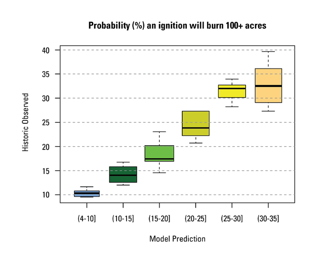
Legacy Large Fire Probability Mapping
This map translates the Fire Potential Index (FPI) map into a probability map. It shows how often we can expect a fire to burn more than 100 acres if a 1+ acre ignition occurred in a given km² grid cell with vegetation flammability conditions similar to those indicated by the FPI map. Equations for the conditional probabilities were developed using historic fire occurrence (2001-2003). The daily map is developed by plugging in the next day forecasted FPI values into the equations for the conditional probability. The map shows the frequency of times an ignition, at a given location and under similar FPI conditions for that day, burned more than 100 acres in the past. The probability is both location and date specific. Namely, for a given FPI value the probability may be different depending on the location or the day-in-year. This probability does not take into account the expected frequency of 1+ acre fire ignitions for that day and location. It simply gives the chance of a fire spreading and burning more than 100 acres IF an ignition occurs.

The next figure shows the goodness-of-fit for the large fire probability maps. It was developed from three years of fire occurrence data (2001-2003). The first thing we see in this plot is that there were no cases during the three years in the study. This is where the estimated probability was less than 4% or greater than 45%. The green box (corresponding to green regions of the map) with model prediction category of (15-20]% states that in the three years in our study we observed a range of values between 15 to 24% with a median of 18%. For the yellow regions of the map with predicted probabilities of (20-25]% we observed a range of values between 18 to 26% with a median at 25% and so on.
Legacy Expected Number of Large Fires per PSA Mapping
This map takes into account both probability of ignition and conditional probability of spread (to 500+ acres in East and 1000+ acres in West*) given ignition. Given the seven Fire Potential Index (FPI) values forecasted for the upcoming week, the map shows the total number of fires to expect in a given Predictive Service Area (PSA). It also shows the degree of confidence for each expected value. For example if the PSA color is yellow; the legend shows there is 40% chance of having at least one large fire in the PSA in the upcoming week. It also shows about 10% chance of having two or more fires, but only about 1% chance of having three or more large fires. The model used to develop the map is based on probabilities that are both location and time (day-in-year) specific. A different probability is assigned to each km² grid cell within the PSA, depending on its location within the PSA and the forecasted FPI value for that location and day. The map of expected number of large fires is developed by aggregating the estimated probabilities for each km² grid cell within the PSA and for each day of the upcoming week. The historical data used for estimating background large fire patterns were from 1984-2010. A subset of this data (2006, 2008-2010) is used to estimate departures from normal patterns based on the FPI.

To read the PSA map, note the color of any given PSA, then find the vertical probability bar of the same color and read the probability of having at least X number of large fires in that PSA. For Example, the PSA in southeast Oregon is light brown. The color bars displayed in the Gulf of America show that light brown is the ninth column to the right. The height of the light brown column in the left legend indicates there would be about a 70% chance of 1 or more large fires, about a 35% chance of 2 or more fires, and a 12% chance of 3 or more fires over the coming week.

The following two graphs show the goodness of fit for the expected number of large fires per PSA (reliability diagrams). The graphs are based on a limited amount of data collected in summer and fall, 2013. Additional data will be collected in 2014 and the graphs will then be updated. It is expected that the 95% bars will narrow with additional data.
The graphs show good agreement between the observed and forecasted proportions of cases with at least one or at least two fires. The agreement is good in that the observed values are within 95% confidence bounds of the corresponding forecasted values (red stars). The 95% confidence bounds indicate the expected range of values given the sample sizes in each group. The bounds for the larger probability groups (0.4, 0.5, 0.6) are large because the number of cases in these categories is very small ( 5, 8 and 4 cases respectively).
The colors in these graphs correspond to the colors in the maps on the website for expected number of large fires per PSA. For example, when the map shows a PSA colored brown, then it is anticipated that there is 60% chance of at least one large fire in the PSA in the upcoming week and 23% chance of at least two large fires. During the 2013 summer and fall fire season we observed at least one fire in 75% of the cases (3 out of 4 cases) and at least two fires in 25% of the cases (1 out of 4). Similarly for the other colors, one can compare the forecasted probabilities (red stars) with the observed probabilities (black diamonds) of at least one or at least two large fires per PSA per upcoming week.

Related

Fire Danger Forecast
Related