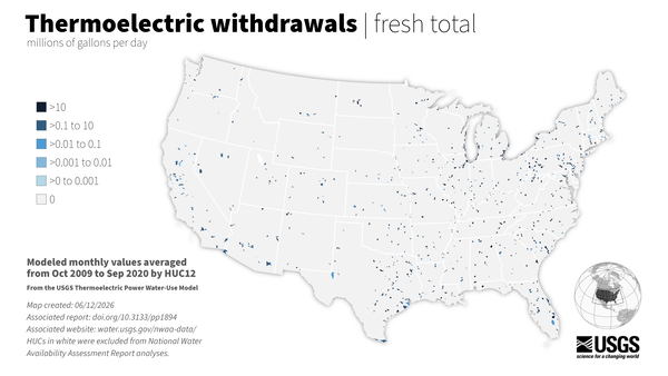
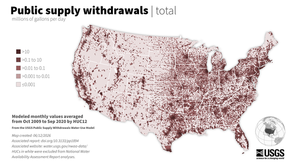
U.S. flag

An official website of the United States government

Multimedia

Discover and download images, data visualizations, and videos that support the National and Regional Water Availability Assessments.

Images

Map of the Upper Colorado River Basin, Integrated Water Availability Assessment.
Map of Upper Colorado River Basin - Integrated Water Availability

Map of the Upper Colorado River Basin —referred to as an Integrated Water Science (IWS) basins—are intensively monitored study basins representing a wide range of environmental, hydrologic, and landscape settings and human stressors of water resources to improve our understanding of water availability across the Nation.

Map of the Upper Colorado River Basin —referred to as an Integrated Water Science (IWS) basins—are intensively monitored study basins representing a wide range of environmental, hydrologic, and landscape settings and human stressors of water resources to improve our understanding of water availability across the Nation.

see caption
Integrated Water Science in the Klamath River Basin, Diagram

Water availability in the Klamath Basin is shaped by three interconnected factors, like overlapping circles in a Venn diagram. First, upper basin controls—such as groundwater, snowpack, and runoff—determine how much water is available. Second, biological opinions set flow requirements to protect endangered fish and habitats, including flushing and geomorphic flows.

Water availability in the Klamath Basin is shaped by three interconnected factors, like overlapping circles in a Venn diagram. First, upper basin controls—such as groundwater, snowpack, and runoff—determine how much water is available. Second, biological opinions set flow requirements to protect endangered fish and habitats, including flushing and geomorphic flows.

Map showing the distribution of modeled water use by category for each watershed (HUC12) in the lower 48 United States.
Water use map (2020)

Average daily water use for the top 3 water use categories in the lower 48 states: thermoelectric power generation, public supply, and crop irrigation.

Average daily water use for the top 3 water use categories in the lower 48 states: thermoelectric power generation, public supply, and crop irrigation.

Illustration showing what happens to the water that falls as precipitation over the continental U.S.
The water cycle of the U.S.

In the lower 48 states, nearly 5,000 billion gallons of water fall in the form of precipitation each day. Most of that water re-enters the atmosphere through evapotranspiration, and about a quarter of our daily water input ends up as streamflow to the Atlantic and Pacific Oceans, Canada or the Gulf of Mexico.

In the lower 48 states, nearly 5,000 billion gallons of water fall in the form of precipitation each day. Most of that water re-enters the atmosphere through evapotranspiration, and about a quarter of our daily water input ends up as streamflow to the Atlantic and Pacific Oceans, Canada or the Gulf of Mexico.

Map showing water limitation using five categories (very low to severe)
Water limitation (2010-2020)

Water limitation across the lower 48. Water limitation is measured as the Supply and Use Index (SUI) which represents the imbalance between water supply and demand. A higher SUI indicates a greater proportion of supply being used. 

Water limitation across the lower 48. Water limitation is measured as the Supply and Use Index (SUI) which represents the imbalance between water supply and demand. A higher SUI indicates a greater proportion of supply being used. 

Stacked bar chart showing the sources of nitrogen by U.S. regions
Sources of Nitrogen across hydrologic regions (total load)

A stacked bar chart showing the sources of Nitrogen across hydrologic regions of CONUS (2010-2020). Colors show the total Nitrogen load contributed from agriculture, atmospheric deposition, natural sources, wastewater, and other human sources.

A stacked bar chart showing the sources of Nitrogen across hydrologic regions of CONUS (2010-2020). Colors show the total Nitrogen load contributed from agriculture, atmospheric deposition, natural sources, wastewater, and other human sources.

Videos

Thumbnail for the National Water Availability Assessment Release Thumbnail for the National Water Availability Assessment Release
National Water Availability Assessment Release

This recorded webinar details the significance and finding of the National Water Availability Assessment Release. 

Was this page helpful?