
Water Insights: Short Education Activities to Explore the NWAA Report
The National Water Availability Assessment (NWAA) is the first nationwide assessment of water availability that includes the amount of water, quality of water, and use of water for human and ecosystem needs. An interactive website was created to highlight key scientific findings of the NWAA report through engaging stories, plain-language explanations, and interactive data visualizations.
Water Insights: Short Activities to Explore the NWAA Report [Lesson Plan]
Water availability in the United States Key Findings - Visualization Web Page
Water Insights: Short Activities to Explore the NWAA Report
What is National Water Availability Assessment (NWAA) Report?
The USGS Water Resources Mission Area has assessed how much water is available for human and ecological needs in the United States and identified where and when the Nation may have challenges meeting its demand for water through the National Water Availability Assessment Report (NWAA). NWAA is the first nationwide assessment of water availability that includes the amount of water, quality of water, and use of water for human and ecosystem needs. Learn more about the National Water Availability Assessments.
An interactive website was created to highlight key scientific findings of the NWAA report through engaging stories, plain-language explanations, and interactive data visualizations.
https://water.usgs.gov/vizlab/water-availability/
Data can be presented in several different ways to tell a story. The story told by data can be very complex, just like the story of how Earth has formed and changed over time. We often pay attention to the data that connects to us.
In these short activities we will go through each of the key finding’s webpages to try to better understand the data in the report and visualizations.
Standards
NGSS
DCI: ESS2.C: The Roles of Water in Earth's Surface Processes, ESS3.C: Human Impacts on Earth Systems
SEP: Analyzing and Interpreting Data, Constructing Explanations and Designing Solutions
CCC: Systems and System Models, Stability and Change, Cause and Effect
Grade recommendation: Middle School (6-8) or High School (9-12)
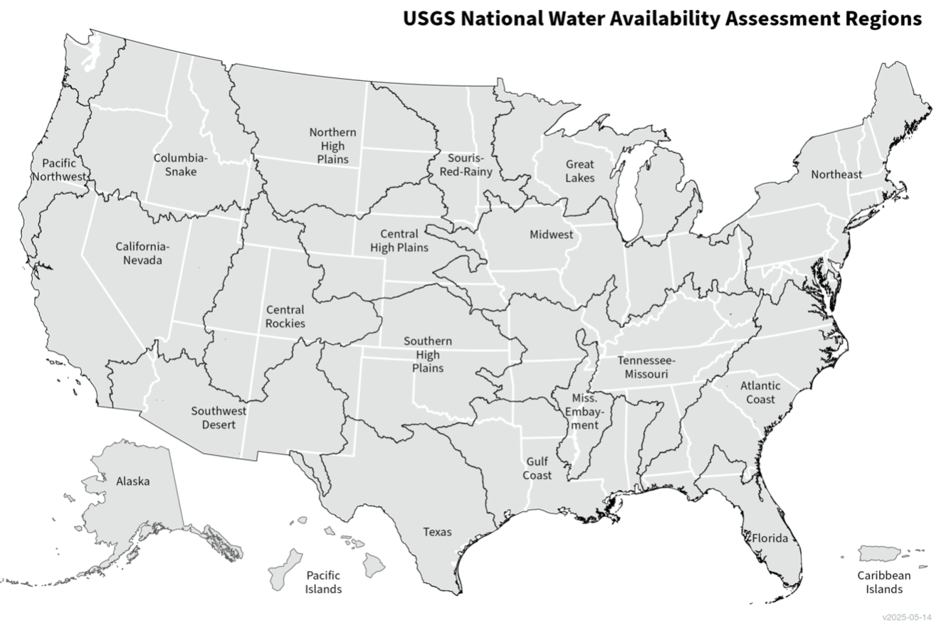
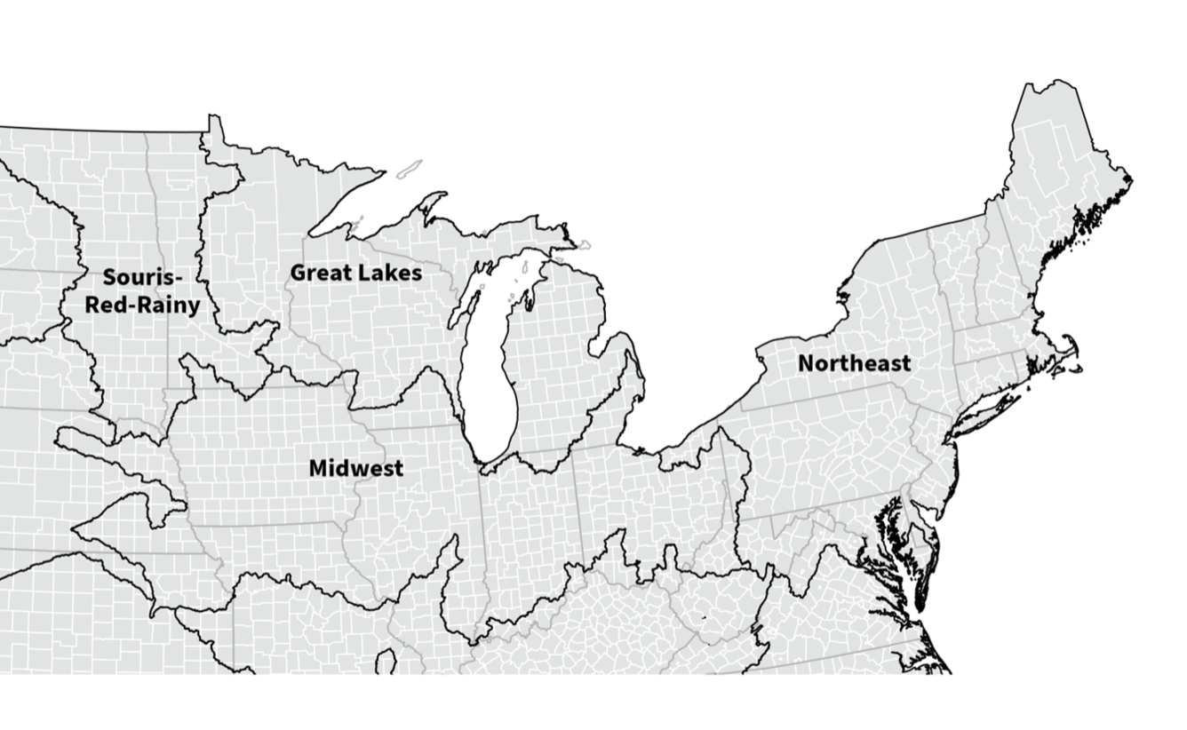
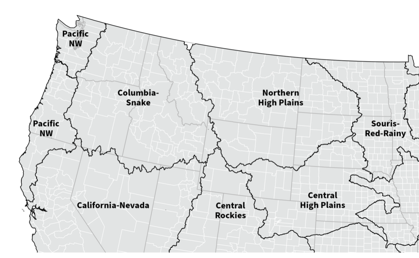
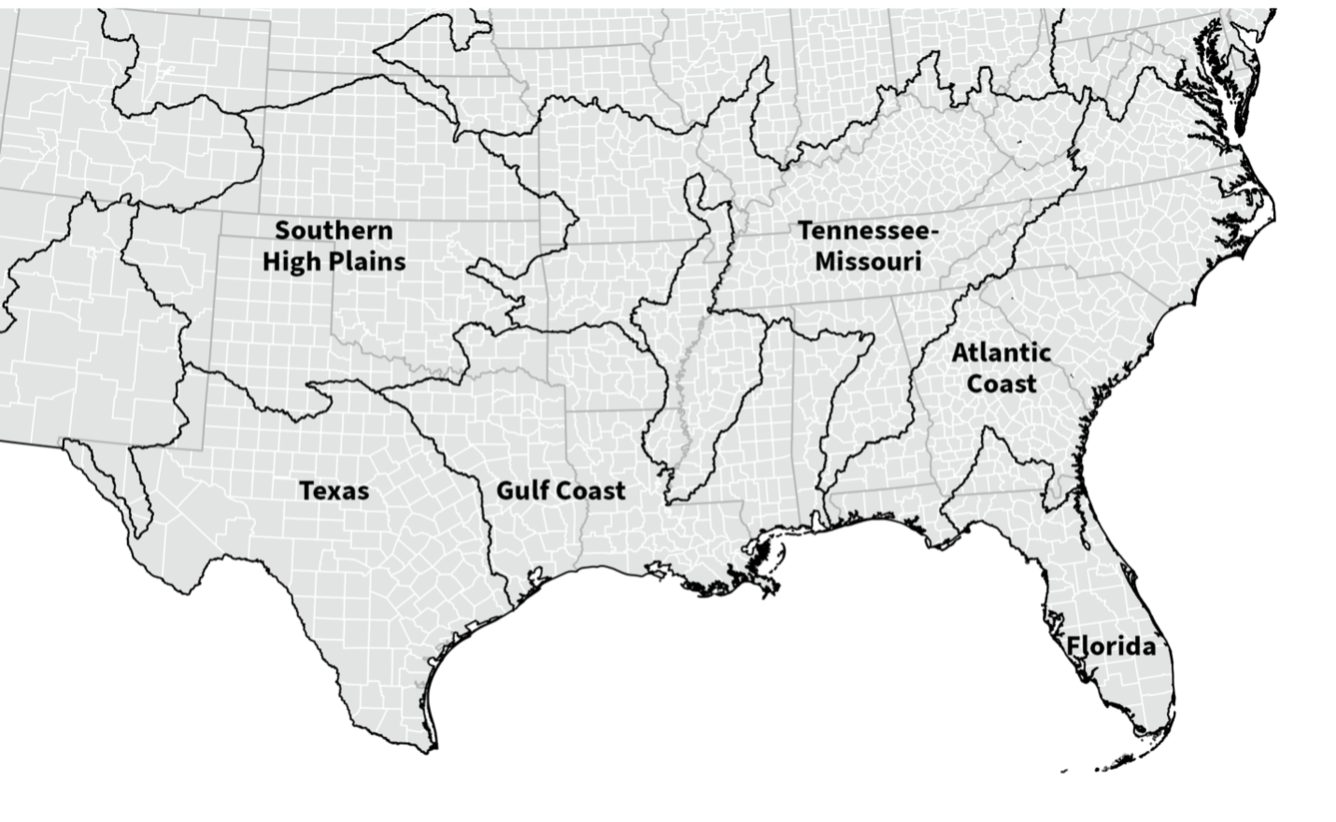
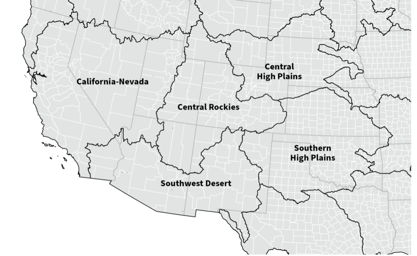
Find Your Region!
In the context of the NWAA (National Water Availability Assessment) activities, understanding that water resource dynamics do not adhere to state borders is essential. Use the map provided to locate your hydrologic region, which will be instrumental in the subsequent activities.
Hydrologic regions are defined by the natural boundaries of watersheds, playing a crucial role in understanding how water moves through the landscape. These regions help us assess water availability and usage in areas that share similar hydrologic characteristics.
By grouping areas into hydrologic regions, policymakers and resource managers can gain valuable insights into regional differences in water supply and demand. This knowledge is vital for effective resource management and sustainability efforts.
Now, let’s find your region on the map!
- Locate your current location on the maps below.
- What is your assessment region? You will use this region throughout the eight activities.
Lesson 1- Do we have enough water? Yes, and no
https://water.usgs.gov/vizlab/water-availability/01-water-limitation
The U.S. has enough water, but not everywhere and not at all times.
At the national scale, water supply is much higher than our demand for water. However, this pattern is not true for all regions or times.
What is Water Limitation?
Water limitation is the balance between supply and demand (water use).
When demand approaches supply, water becomes limited. At local and regional scales, water limitation impacts human, and ecosystem needs. Let’s take a look at water supply and water demand in the lower 48 of the United States.
For this activity, we will be using the 1st and 2nd visualization showing water supply vs demand and spatial water limitation.
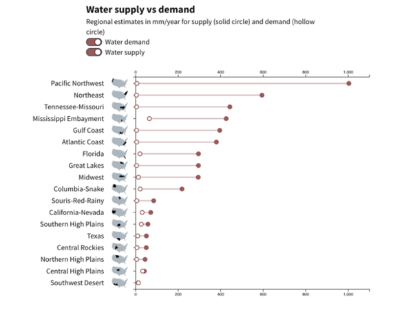
The 1st chart shows the total supply and demand between 2010 and 2020 for hydrologic regions.
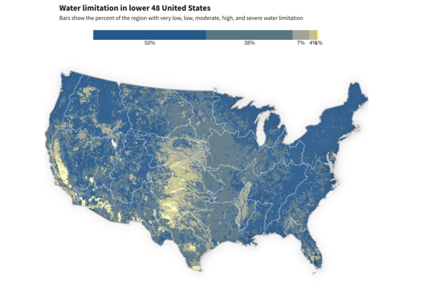
The 2nd map shows water limitation spatially in the lower 48 of the United States.
Key Terms:
- Water Supply - the amount of water available
- Water Demand – amount of water people and the ecosystem needs
- Water Limitation - the balance between supply and demand (water use)
Use visualization 1 and 2 on the page to answer the following questions.
- Locate your region on the 1st visualization.
How does your region’s water supply compare to the water demand?
Locate your region on the map in the 2nd visualization. What is the water limitation for your region?
- What do you know about water supply and water demand in your region? How might these factors affect water limitation?
- Pick another region on the map in the 2nd visualization
How does this region’s water supply compare to the water demand.
i. Describe any similarities or differences you observe in this region’s water supply and demand compared to your region?
- On the 2nd visualization, locate the same region on the map. How does its water limitation compare to your region?
Lesson 2 - Limits on water availability
https://water.usgs.gov/vizlab/water-availability/02-water-availability
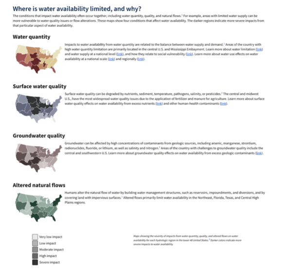
Water availability is affected by water quantity, quality, and flow.
Every region in the lower 48 United States faces limitations to water availability from at least one aspect of water quantity, quality, or flow.
For this activity, we will be using the visualization on the page.
Key Terms:
- Water Availability: Water availability refers to how much water is physically accessible (water quantity) and whether that water is safe to use (water quality).
Use visualization 2 to answer the following questions.
- Look at the legend
What do the darker shades represent?
- What do the lighter shades represent?
- Split into groups of four
- Assign one water condition to each member of the group.
- Water quantity
- Surface water quality
- Groundwater quality
Altered natural flows.
- Assign one water condition to each member of the group.
- Individually: Each group member should locate their region on their assigned water condition and answer the following the questions:
What is the severity of impact in your region for your assigned water condition?
- Identify and explain at least 2 factors that you think contribute to the level of impact for your assigned water condition.
- Discuss as a group
Explain how your water condition is impacted in your region.
Do you see any similarities in the spatial patterns of the different water conditions?
Do you see any differences?
- Explain why you think those differences or similarities exist between the water conditions.
Lesson 3: Unequal access to water
https://water.usgs.gov/vizlab/water-availability/03-vulnerability
Socially vulnerable Americans have a higher risk of water limitation
For this activity, we will be using the visualization on the page. Each circle represents a hydrologic unit (HUC).
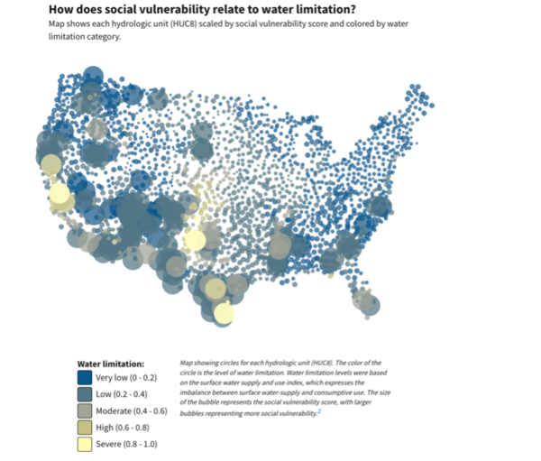
Key Terms:
- Social vulnerability: Conditions in which societal factors shape exposure to hazards, susceptibility to suffer harm, and ability to cope and recover from losses.
- Hydrologic Unit: A hydrologic unit represents the area of the landscape that drains to a portion of the stream network. Each drainage has a unique Hydrologic Unit Code (HUC).
Use visualization 3 to answer the following questions.
- What does the size of the circles on the chart represent?
- What does the color of the circle represent?
- Find your location.
Water limitation ranges from low (0.0 - 0.2) to severe (0.8-1.0) which is shown using colors from blue to yellow. What is the Water limitation of your region? You can use the map on (https://water.usgs.gov/vizlab/water-availability/01-water-limitation) to help you determine your region’s degree of water limitation.
- How does it relate to the social vulnerability?
- Choose another location. You can use the map on (https://water.usgs.gov/vizlab/water-availability/01-water-limitation) to help you determine your region’s degree of water limitation.
What is the water limitation?
How does this region’s social vulnerability relate to your original region
- Explain what factors may contribute to the similarities are difference you observe.
Lesson 4: Not enough rain and snow
https://water.usgs.gov/vizlab/water-availability/04-water-supply
Limited water supply can cause water imbalance
For this activity, we will be using the 2nd visualization on the page. This visualization shows the amount of water in different parts of the water cycle (precipitation, evapotranspiration, soil moisture, and streamflow) through time.
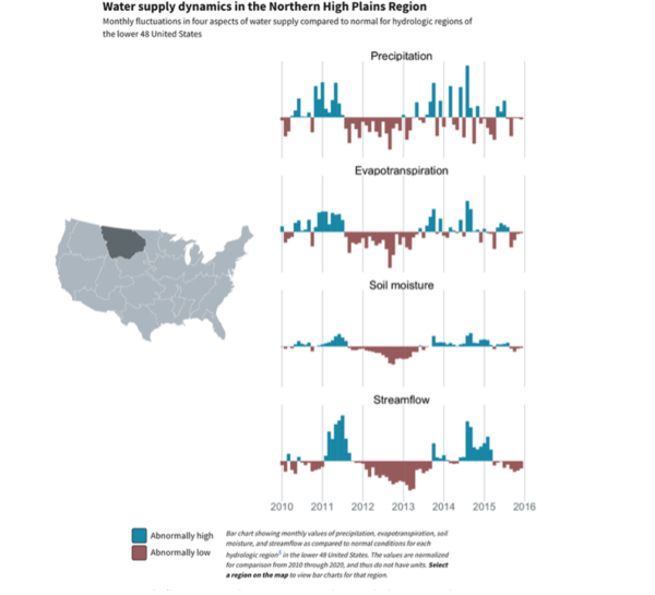
The blue bars pointing up means there was more water at that time than usual. Red bars pointing down mean there was less water than usual at that time.
Key Terms:
- Precipitation: Precipitation is water released from clouds in the form of rain, freezing rain, sleet, snow, or hail
- Evaporation: the process of liquid water becoming water vapor, including vaporization from water surfaces, land surfaces, and snow fields, but not from leaf surfaces.
- Transpiration: process by which water that is absorbed by plants, usually through the roots, is evaporated into the atmosphere from the plant surface, such as leaf pores
- Evapotranspiration: the sum of evaporation and transpiration.
- Soil moisture: the total amount of water, including water vapor, in an unsaturated soil.
- Discharge: the volume of water that passes a given location within a given period of time. Usually expressed in cubic feet per second.
- Streamflow: the water discharge that occurs in a natural channel. A more general term than runoff, streamflow may be applied to discharge whether or not it is affected by diversion or regulation.
Use visualization 2 to answer the following questions.
- Locate your region on the Map. Use the mouse to hover your region and observe how the bar chart updates.
- Describe the patterns you see between the four factors listed on the graph. How are these factors connected?
Choose one factor from your region.
- Name the factor. Do you see any trends within that factor over time?
- Pick another region.
How do the patterns of the four factors compare to your region?
Predict why there might be a difference or similarity between regions.
Lesson 5. Nutrients in the water
https://water.usgs.gov/vizlab/water-availability/05-nutrients
Natural and human sources of nutrients degrade water quality
Sources of nutrients in our water vary across the United States. Common sources of nutrients such as nitrogen and phosphorus include fertilizer and manure, atmospheric deposition, wastewater treatment plants, urban land, and a range of natural sources including stream channel and geologic sources (also called geogenic sources).
Where do nutrients come from?
Nutrients are added to our waterways through natural sources and human activities. Human activities affect water quality through multiple pathways, including application or movement of contaminants like fertilizers or organic chemicals on the land surface from agriculture or atmospheric deposition, which generally has human origins; wastewater treatment plant discharge, and other human sources such as dredging, mining, dams, and urbanization. Natural sources of nutrients include streams and springs, forests, and fixation of atmospheric nitrogen by soil bacteria that is transported to streams, geogenic sources, fixation by aquatic bacteria and algae, and lightning strikes.
For this activity, we will be using the 2nd visualization on the page.
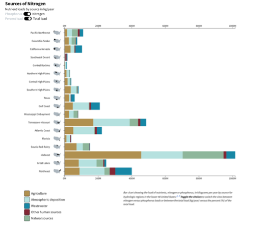
This chart shows the source of Nitrogen and Phosphorus across hydrologic regions.
Key Terms:
- Nutrients: Chemicals that are essential to the growth, reproduction, and metabolic processes of living organisms. Aquatic ecosystems require nutrients to support the biological communities they contain. However, overabundant nutrients can contribute to various water-quality problems.
- Total load: This refers to the total mass of a specific nutrient.
- Percent load: This indicates the percentage of a specific source compared to the total nutrient mass
Using the 2nd visualization on this page answer the following questions.
- Observe the toggles on the upper left corner (Nutrient loads by source in kg/year)
What is the difference between percent load and total load?
In what situations might you choose to analyze percent load instead of total load?
- Why would this be important for understanding water quality?
- Locate your region on the Map.
Observe either Nitrogen or Phosphorus (select one nutrient) load graph. (Make sure your chosen nutrient is toggled on)
What is the major source of selected nutrient loading in your region? (to view in better detail, toggle on Percent load)
Considering the major sources of selected nutrient loading in your region, how might these sources impact local water quality and ecosystems?
- Pick another region.
- Select the same nutrient chosen in previous question
Is there a difference in the major source of your chosen nutrient in the new region?
- What factors might contribute to any differences or similarities you observe?
- Select the same nutrient chosen in previous question
To Learn more about Nutrients in water please visit the Water Science School
Nitrogen: Nitrogen and Water Phosphorus: Phosphorus and Water
Lesson 6. Threats to water quality
https://water.usgs.gov/vizlab/water-availability/06-water-quality
Water quality issues can affect human and aquatic health
Drinking water, fish consumption, and recreational water use face different water quality threats.
Groundwater quality varies regionally
Groundwater is the drinking-water source for about one-third of the Nation's population. Geogenic contaminants, which come from geologic sources like bedrock and sediment, are the most common contaminants found in drinking water aquifers at elevated or high concentrations. These geogenic contaminants affect more than 30 million people in the lower 48 United States.
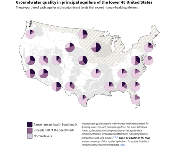
For this activity, we will be using the visualization on the page. This map show groundwater contaminant levels across drinking water aquifers.
Key Terms:
- Groundwater: Water that flows or seeps downward and saturates soil or rock, supplying springs and wells. The upper surface of the saturate zone is called the water table. (2) Water stored underground in rock crevices and in the pores of geologic materials that make up the Earth's crust.
- Geogenics: Naturally occurring contaminants from geologic sources like bedrock and sediment. Five geogenic contaminants in particular (arsenic, manganese, strontium, radium, and radionuclides) affect a substantially large area and part of the population.
- Human-health benchmark: Human health benchmarks are non-enforceable drinking water levels that provide information about adverse health effects from drinking water exposure to contaminants that have no drinking water standards or health advisories.
Using the visualization on this answer the following questions.
What do the terms 'above human health benchmark,' 'exceeds half of the benchmark,' and 'normal levels' mean.
- How can we interpret what this tells us about the groundwater quality in the different aquifers?
- Locate your aquifer or nearest aquifer on the map.
- Describe the aquifer’s pie chart using terms from the legend.
- Can you name one factor that might contribute to groundwater quality in your aquifer? Explain.
Lesson 7. For farm, home, and energy
https://water.usgs.gov/vizlab/water-availability/07-water-use
The largest demands for water are for crop irrigation, public supply, and thermoelectric power
About 224,000 million gallons of freshwater are used every day for irrigation (48%), public supply (16%), and thermoelectric power (36%).
An understanding of where, when, why, and how much water is extracted for human use is fundamental to understanding the Nation's water availability. Around 90% of daily water use in the United States goes toward Crop irrigation, Thermoelectric power plants and Public supply.
These three uses add up to 224,000 million gallons of freshwater per day. In addition, saline water used at thermoelectric power plants adds another approximately 21,000 million gallons of water per day.
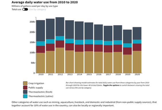
For this activity, we will be using the 1st visualization on the page. These charts show water use by type over 10 years.
Key Terms:
- Crop irrigation: the controlled application of water to agricultural land to supplement natural rainfall and meet the water needs of crops for optimal growth and productivity
- Thermoelectric power plants (Fresh): where freshwater is used in the process of creating energy
- Thermoelectric power plants (Saline): where salt water is used in the process of creating energy
- Public supply: where water is withdrawn or purchased by a water supplier and delivered to many users
Use the 1st visualization on this page to answer the following questions.
- On the graph, toggle “Total use” on.
What is the major use category of daily water use in the lower 48 United States?
- Do you think your state follows this pattern? Why or why not?
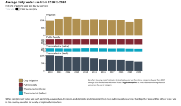
2. On the graph toggle “Use by category” on
b. Describe the patterns you see in the different categories over the years.
Lesson 8. From sea to shining sea
https://water.usgs.gov/vizlab/water-availability/08-regional-wu
How we use water varies across the country
Do we use more surface water or groundwater?
Across the U.S., this depends on the availability of each source, the category of use, local and federal water use ordinances, and water rights. On average during 2010-2020, about 62% of water used for crop irrigation, public supply, and thermoelectric was sourced from surface water rather than groundwater. However, these proportions vary widely across the country: the largest water withdrawals in the Southwest Desert region for public supply are from groundwater, whereas the largest withdrawals in the Northeast region are from surface water.
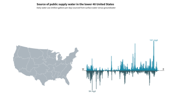
For this activity, we will be using the 2nd visualization on the page. This visualization shows the amount of water supply from surface water and groundwater across hydrologic regions.
Key Terms:
- mgd: million gallons per day
- Surface water: water that is on the Earth's surface, such as in a stream, river, lake, or reservoir.
Groundwater: Water that flows or seeps downward and saturates soil or rock, supplying springs and wells. Water stored underground in rock crevices and in the pores of geologic materials that make up the Earth's crust.
Using the 2nd visualization on this page answer the following questions.
- Locate your region on the Map.
Does your region’s public water supply rely more on groundwater or surface water?
- Why do you think your region primarily uses that type of water?
- Pick a different region on map.
Does your region’s public water supply rely more on groundwater or surface water?
In comparing this region to your own, does it rely more on groundwater or surface water?
- What factors might explain the differences in water usage between the two regions?