Diagram of a Typical Streamgage Installation With Equipment
Diagram of a Typical Streamgage Installation With EquipmentDiagram of a typical streamgage installation with equipment used to measure stream stage

Official websites use .gov
A .gov website belongs to an official government organization in the United States.
Secure .gov websites use HTTPS
A lock () or https:// means you’ve safely connected to the .gov website. Share sensitive information only on official, secure websites.
Dr. Althea A. Archer is a Science Communicator in the Web Communications Branch of the USGS Water Resources Mission Area, Integrated Information Dissemination Division.
Althea combines her passion for communication, data visualization, and writing to tell stories of USGS water science to the public. Her goal is to make science understandable and actionable for all.

Diagram of a typical streamgage installation with equipment used to measure stream stage
Diagram of a typical streamgage installation with equipment used to measure stream stage

Diagram of how USGS water data are transferred from streamgage to the internet
Diagram of how USGS water data are transferred from streamgage to the internet
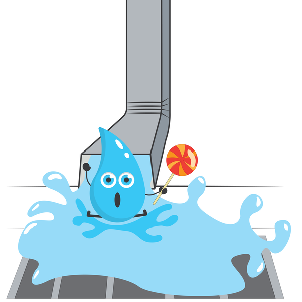
Illustration of Drippy, USGS Water's unofficial mascot, splashing out of a drain pipe into a sewer with a lollipop in his hand. This illustration was used to represent the USGS study of artificial sweeteners as they enter the water cycle.
Illustration of Drippy, USGS Water's unofficial mascot, splashing out of a drain pipe into a sewer with a lollipop in his hand. This illustration was used to represent the USGS study of artificial sweeteners as they enter the water cycle.
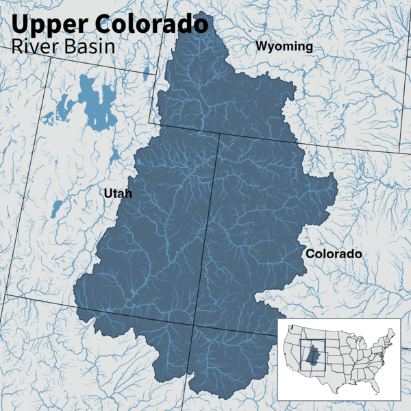
Map of the Upper Colorado River Basin —referred to as an Integrated Water Science (IWS) basins—are intensively monitored study basins representing a wide range of environmental, hydrologic, and landscape settings and human stressors of water resources to improve our understanding of water availability across the Nation.
Map of the Upper Colorado River Basin —referred to as an Integrated Water Science (IWS) basins—are intensively monitored study basins representing a wide range of environmental, hydrologic, and landscape settings and human stressors of water resources to improve our understanding of water availability across the Nation.
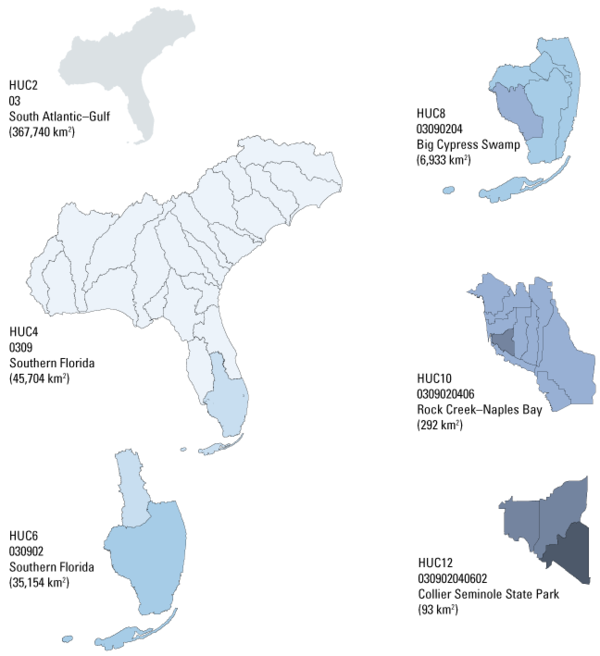
The U.S. Geological Survey uses a depiction and classification scheme for hydrologic units known as hydrologic unit codes (HUCs). HUCs generally represent catchments, and river basins are represented by a unique series of numbers with successively smaller hydrologic units nested inside of larger ones.
The U.S. Geological Survey uses a depiction and classification scheme for hydrologic units known as hydrologic unit codes (HUCs). HUCs generally represent catchments, and river basins are represented by a unique series of numbers with successively smaller hydrologic units nested inside of larger ones.
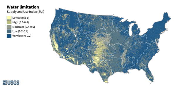
Water limitation across the lower 48. Water limitation is measured as the Supply and Use Index (SUI) which represents the imbalance between water supply and demand. A higher SUI indicates a greater proportion of supply being used.
Water limitation across the lower 48. Water limitation is measured as the Supply and Use Index (SUI) which represents the imbalance between water supply and demand. A higher SUI indicates a greater proportion of supply being used.

Diagram of the process of water use from source (surface water, groundwater, reuse water) through transmission, utility reservoir, water treatment, distribution, and withdrawal for industry, residential, and commercial.
Diagram of the process of water use from source (surface water, groundwater, reuse water) through transmission, utility reservoir, water treatment, distribution, and withdrawal for industry, residential, and commercial.

A cross-sectional view of a hypothetical coastline showing one possible arrangement of the three Federal Flood Risk Management Standard (FFRMS) floodplain elevations (Climate-Informed Science Approach, the Freeboard Value Approach, and the 0.2% Annual-Chance Flood Approach) above the current Base Flood Elevation, i.e., the 1% annual-chance flood elevation.
A cross-sectional view of a hypothetical coastline showing one possible arrangement of the three Federal Flood Risk Management Standard (FFRMS) floodplain elevations (Climate-Informed Science Approach, the Freeboard Value Approach, and the 0.2% Annual-Chance Flood Approach) above the current Base Flood Elevation, i.e., the 1% annual-chance flood elevation.

A cross-sectional view of a hypothetical coastline showing one possible arrangement of the three Federal Flood Risk Management Standard (FFRMS) floodplain elevations (Climate-Informed Science Approach, the Freeboard Value Approach, and the 0.2% Annual-Chance Flood Approach) above the current Base Flood Elevation, i.e., the 1% annual-chance flood elevation.
A cross-sectional view of a hypothetical coastline showing one possible arrangement of the three Federal Flood Risk Management Standard (FFRMS) floodplain elevations (Climate-Informed Science Approach, the Freeboard Value Approach, and the 0.2% Annual-Chance Flood Approach) above the current Base Flood Elevation, i.e., the 1% annual-chance flood elevation.

A cross-sectional view of a hypothetical river showing one possible arrangement of the three Federal Flood Risk Management Standard (FFRMS) floodplain elevations (Climate-Informed Science Approach, the Freeboard Value Approach, and the 0.2% Annual-Chance Flood Approach) above the current Base Flood Elevation, i.e., the 1% annual-chance flood elevation.
A cross-sectional view of a hypothetical river showing one possible arrangement of the three Federal Flood Risk Management Standard (FFRMS) floodplain elevations (Climate-Informed Science Approach, the Freeboard Value Approach, and the 0.2% Annual-Chance Flood Approach) above the current Base Flood Elevation, i.e., the 1% annual-chance flood elevation.

A cross-sectional view of a hypothetical river showing one possible arrangement of the three Federal Flood Risk Management Standard (FFRMS) floodplain elevations (Climate-Informed Science Approach, the Freeboard Value Approach, and the 0.2% Annual-Chance Flood Approach) above the current Base Flood Elevation, i.e., the 1% annual-chance flood elevation.
A cross-sectional view of a hypothetical river showing one possible arrangement of the three Federal Flood Risk Management Standard (FFRMS) floodplain elevations (Climate-Informed Science Approach, the Freeboard Value Approach, and the 0.2% Annual-Chance Flood Approach) above the current Base Flood Elevation, i.e., the 1% annual-chance flood elevation.

A timeseries of monthly Oceanic Niño Index values from 1950 to 2023. The y-axis is mirrored at 0, with positive teal values indicating el Niño periods and negative lavender values corresponding to la Niña periods. The chart sits over a watercolor wash that has a gradient from teal at the top to lavender at the bottom.
A timeseries of monthly Oceanic Niño Index values from 1950 to 2023. The y-axis is mirrored at 0, with positive teal values indicating el Niño periods and negative lavender values corresponding to la Niña periods. The chart sits over a watercolor wash that has a gradient from teal at the top to lavender at the bottom.

Animation showing changes in stream temperature relative to air temperature over the course of a day. The animation begins at midnight, adding a point at each half-hour interval. After dawn, as air temperature starts warming, the stream warms more slowly than air, and water temperature lags behind air temperature.
Animation showing changes in stream temperature relative to air temperature over the course of a day. The animation begins at midnight, adding a point at each half-hour interval. After dawn, as air temperature starts warming, the stream warms more slowly than air, and water temperature lags behind air temperature.

A scatter plot of water temperature versus air temperature on April 27, 2019, for the Paine Run stream in Shenandoah National Park. Points are plotted for each 30-minute interval. Daytime points are hollow, while nighttime points are solid.
A scatter plot of water temperature versus air temperature on April 27, 2019, for the Paine Run stream in Shenandoah National Park. Points are plotted for each 30-minute interval. Daytime points are hollow, while nighttime points are solid.

A map of the contiguous U.S. using a snowflake hex pattern to show relative snow cover for March 2023 compared to 20-year average (2003 through 2022). Much of the western states experienced more snow than normal, such as the Rocky Mountains and the upper Great Plains. Much of the eastern U.S.
A map of the contiguous U.S. using a snowflake hex pattern to show relative snow cover for March 2023 compared to 20-year average (2003 through 2022). Much of the western states experienced more snow than normal, such as the Rocky Mountains and the upper Great Plains. Much of the eastern U.S.
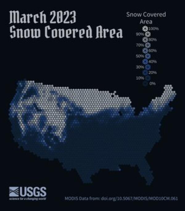
A map of the contiguous U.S. using a snowflake hex pattern to show snow cover for March 2023. Snowier places are white with snow, emphasizing the Rocky Mountains and Sierra range in the western U.S., the Upper Midwest, and Maine in the northeast.
A map of the contiguous U.S. using a snowflake hex pattern to show snow cover for March 2023. Snowier places are white with snow, emphasizing the Rocky Mountains and Sierra range in the western U.S., the Upper Midwest, and Maine in the northeast.

A Tale of two winters. A map of CONUS and lollipop style charts show the difference in percent snow covered area for February 2023 compared to the 20-year mean (2003-2022). Paired charts show the relationships between latitude, longitude, and difference in percent snow covered area, depicting two very different winters between the coasts.
A Tale of two winters. A map of CONUS and lollipop style charts show the difference in percent snow covered area for February 2023 compared to the 20-year mean (2003-2022). Paired charts show the relationships between latitude, longitude, and difference in percent snow covered area, depicting two very different winters between the coasts.

A data visualization showing how Minimum Annual Streamflow has changed from generation to generation over the past 100 years. Across the contiguous United States, streamflow has increased by 22% when comparing the baseline “Silent generation” (1920 – 1946) against the Gen Z years (1997-2020).
A data visualization showing how Minimum Annual Streamflow has changed from generation to generation over the past 100 years. Across the contiguous United States, streamflow has increased by 22% when comparing the baseline “Silent generation” (1920 – 1946) against the Gen Z years (1997-2020).

Six panel data visualization in the graphical form of a comic. The first panel is of a bright sun with trees lining a street that has tall buildings on either side.
Six panel data visualization in the graphical form of a comic. The first panel is of a bright sun with trees lining a street that has tall buildings on either side.

This diagram, released in 2022, depicts the global water cycle. It shows how human water use affects where water is stored, how it moves, and how clean it is. This diagram is available in English and Spanish.
This diagram, released in 2022, depicts the global water cycle. It shows how human water use affects where water is stored, how it moves, and how clean it is. This diagram is available in English and Spanish.

*English is the official language and authoritative version of all federal information
*English is the official language and authoritative version of all federal information
Diagram of a typical streamgage installation with equipment used to measure stream stage
Diagram of a typical streamgage installation with equipment used to measure stream stage
Diagram of how USGS water data are transferred from streamgage to the internet
Diagram of how USGS water data are transferred from streamgage to the internet
Illustration of Drippy, USGS Water's unofficial mascot, splashing out of a drain pipe into a sewer with a lollipop in his hand. This illustration was used to represent the USGS study of artificial sweeteners as they enter the water cycle.
Illustration of Drippy, USGS Water's unofficial mascot, splashing out of a drain pipe into a sewer with a lollipop in his hand. This illustration was used to represent the USGS study of artificial sweeteners as they enter the water cycle.
Map of the Upper Colorado River Basin —referred to as an Integrated Water Science (IWS) basins—are intensively monitored study basins representing a wide range of environmental, hydrologic, and landscape settings and human stressors of water resources to improve our understanding of water availability across the Nation.
Map of the Upper Colorado River Basin —referred to as an Integrated Water Science (IWS) basins—are intensively monitored study basins representing a wide range of environmental, hydrologic, and landscape settings and human stressors of water resources to improve our understanding of water availability across the Nation.
The U.S. Geological Survey uses a depiction and classification scheme for hydrologic units known as hydrologic unit codes (HUCs). HUCs generally represent catchments, and river basins are represented by a unique series of numbers with successively smaller hydrologic units nested inside of larger ones.
The U.S. Geological Survey uses a depiction and classification scheme for hydrologic units known as hydrologic unit codes (HUCs). HUCs generally represent catchments, and river basins are represented by a unique series of numbers with successively smaller hydrologic units nested inside of larger ones.
Water limitation across the lower 48. Water limitation is measured as the Supply and Use Index (SUI) which represents the imbalance between water supply and demand. A higher SUI indicates a greater proportion of supply being used.
Water limitation across the lower 48. Water limitation is measured as the Supply and Use Index (SUI) which represents the imbalance between water supply and demand. A higher SUI indicates a greater proportion of supply being used.
Diagram of the process of water use from source (surface water, groundwater, reuse water) through transmission, utility reservoir, water treatment, distribution, and withdrawal for industry, residential, and commercial.
Diagram of the process of water use from source (surface water, groundwater, reuse water) through transmission, utility reservoir, water treatment, distribution, and withdrawal for industry, residential, and commercial.
A cross-sectional view of a hypothetical coastline showing one possible arrangement of the three Federal Flood Risk Management Standard (FFRMS) floodplain elevations (Climate-Informed Science Approach, the Freeboard Value Approach, and the 0.2% Annual-Chance Flood Approach) above the current Base Flood Elevation, i.e., the 1% annual-chance flood elevation.
A cross-sectional view of a hypothetical coastline showing one possible arrangement of the three Federal Flood Risk Management Standard (FFRMS) floodplain elevations (Climate-Informed Science Approach, the Freeboard Value Approach, and the 0.2% Annual-Chance Flood Approach) above the current Base Flood Elevation, i.e., the 1% annual-chance flood elevation.
A cross-sectional view of a hypothetical coastline showing one possible arrangement of the three Federal Flood Risk Management Standard (FFRMS) floodplain elevations (Climate-Informed Science Approach, the Freeboard Value Approach, and the 0.2% Annual-Chance Flood Approach) above the current Base Flood Elevation, i.e., the 1% annual-chance flood elevation.
A cross-sectional view of a hypothetical coastline showing one possible arrangement of the three Federal Flood Risk Management Standard (FFRMS) floodplain elevations (Climate-Informed Science Approach, the Freeboard Value Approach, and the 0.2% Annual-Chance Flood Approach) above the current Base Flood Elevation, i.e., the 1% annual-chance flood elevation.
A cross-sectional view of a hypothetical river showing one possible arrangement of the three Federal Flood Risk Management Standard (FFRMS) floodplain elevations (Climate-Informed Science Approach, the Freeboard Value Approach, and the 0.2% Annual-Chance Flood Approach) above the current Base Flood Elevation, i.e., the 1% annual-chance flood elevation.
A cross-sectional view of a hypothetical river showing one possible arrangement of the three Federal Flood Risk Management Standard (FFRMS) floodplain elevations (Climate-Informed Science Approach, the Freeboard Value Approach, and the 0.2% Annual-Chance Flood Approach) above the current Base Flood Elevation, i.e., the 1% annual-chance flood elevation.
A cross-sectional view of a hypothetical river showing one possible arrangement of the three Federal Flood Risk Management Standard (FFRMS) floodplain elevations (Climate-Informed Science Approach, the Freeboard Value Approach, and the 0.2% Annual-Chance Flood Approach) above the current Base Flood Elevation, i.e., the 1% annual-chance flood elevation.
A cross-sectional view of a hypothetical river showing one possible arrangement of the three Federal Flood Risk Management Standard (FFRMS) floodplain elevations (Climate-Informed Science Approach, the Freeboard Value Approach, and the 0.2% Annual-Chance Flood Approach) above the current Base Flood Elevation, i.e., the 1% annual-chance flood elevation.
A timeseries of monthly Oceanic Niño Index values from 1950 to 2023. The y-axis is mirrored at 0, with positive teal values indicating el Niño periods and negative lavender values corresponding to la Niña periods. The chart sits over a watercolor wash that has a gradient from teal at the top to lavender at the bottom.
A timeseries of monthly Oceanic Niño Index values from 1950 to 2023. The y-axis is mirrored at 0, with positive teal values indicating el Niño periods and negative lavender values corresponding to la Niña periods. The chart sits over a watercolor wash that has a gradient from teal at the top to lavender at the bottom.
Animation showing changes in stream temperature relative to air temperature over the course of a day. The animation begins at midnight, adding a point at each half-hour interval. After dawn, as air temperature starts warming, the stream warms more slowly than air, and water temperature lags behind air temperature.
Animation showing changes in stream temperature relative to air temperature over the course of a day. The animation begins at midnight, adding a point at each half-hour interval. After dawn, as air temperature starts warming, the stream warms more slowly than air, and water temperature lags behind air temperature.
A scatter plot of water temperature versus air temperature on April 27, 2019, for the Paine Run stream in Shenandoah National Park. Points are plotted for each 30-minute interval. Daytime points are hollow, while nighttime points are solid.
A scatter plot of water temperature versus air temperature on April 27, 2019, for the Paine Run stream in Shenandoah National Park. Points are plotted for each 30-minute interval. Daytime points are hollow, while nighttime points are solid.
A map of the contiguous U.S. using a snowflake hex pattern to show relative snow cover for March 2023 compared to 20-year average (2003 through 2022). Much of the western states experienced more snow than normal, such as the Rocky Mountains and the upper Great Plains. Much of the eastern U.S.
A map of the contiguous U.S. using a snowflake hex pattern to show relative snow cover for March 2023 compared to 20-year average (2003 through 2022). Much of the western states experienced more snow than normal, such as the Rocky Mountains and the upper Great Plains. Much of the eastern U.S.
A map of the contiguous U.S. using a snowflake hex pattern to show snow cover for March 2023. Snowier places are white with snow, emphasizing the Rocky Mountains and Sierra range in the western U.S., the Upper Midwest, and Maine in the northeast.
A map of the contiguous U.S. using a snowflake hex pattern to show snow cover for March 2023. Snowier places are white with snow, emphasizing the Rocky Mountains and Sierra range in the western U.S., the Upper Midwest, and Maine in the northeast.
A Tale of two winters. A map of CONUS and lollipop style charts show the difference in percent snow covered area for February 2023 compared to the 20-year mean (2003-2022). Paired charts show the relationships between latitude, longitude, and difference in percent snow covered area, depicting two very different winters between the coasts.
A Tale of two winters. A map of CONUS and lollipop style charts show the difference in percent snow covered area for February 2023 compared to the 20-year mean (2003-2022). Paired charts show the relationships between latitude, longitude, and difference in percent snow covered area, depicting two very different winters between the coasts.
A data visualization showing how Minimum Annual Streamflow has changed from generation to generation over the past 100 years. Across the contiguous United States, streamflow has increased by 22% when comparing the baseline “Silent generation” (1920 – 1946) against the Gen Z years (1997-2020).
A data visualization showing how Minimum Annual Streamflow has changed from generation to generation over the past 100 years. Across the contiguous United States, streamflow has increased by 22% when comparing the baseline “Silent generation” (1920 – 1946) against the Gen Z years (1997-2020).
Six panel data visualization in the graphical form of a comic. The first panel is of a bright sun with trees lining a street that has tall buildings on either side.
Six panel data visualization in the graphical form of a comic. The first panel is of a bright sun with trees lining a street that has tall buildings on either side.
This diagram, released in 2022, depicts the global water cycle. It shows how human water use affects where water is stored, how it moves, and how clean it is. This diagram is available in English and Spanish.
This diagram, released in 2022, depicts the global water cycle. It shows how human water use affects where water is stored, how it moves, and how clean it is. This diagram is available in English and Spanish.
*English is the official language and authoritative version of all federal information
*English is the official language and authoritative version of all federal information