
Total water use for the top 3 water use categories: thermoelectric power generation, public supply, and crop irrigation. These three categories make up 90% of all water use in the contiguous United States.
Cee Nell, PhD
Dr. Cee Nell builds teams, tools, and visualizations to connect the public with USGS science
Cee is a Data Scientist in the Web Communications Branch of the USGS Water Mission Area, where he leads the Communications & Engagement Team. In this role, he leads information delivery efforts through the development of science communication and visualization products, analytical workflows, and software packages to work with USGS data.
Science and Products

USGS Data in K-12 Education: Inspiring Future Scientists
Co-producing adaptable applications and trainings using USGS data to enhance data literacy in K-12 education.
Water Data Visualizations
Water data visualizations are provocative visuals and captivating stories that inform, inspire, and empower people to address our Nation's most pressing water issues. USGS data science and visualization experts use visualizations to communicate water data in compelling and often interactive ways when static images or written narrative can’t effectively communicate the interconnectivity and...
Filter Total Items: 44

Total water use (2010-2020)
Total water use for the top 3 water use categories: thermoelectric power generation, public supply, and crop irrigation. These three categories make up 90% of all water use in the contiguous United States.

U.S. River Conditions, October to December 2023
This is an animation showing the changing conditions relative to the historic record of USGS streamgages from October 1, 2023 to December 31, 2023. The river conditions shown range from the driest condition seen at a gage (red open circles) to the wettest (blue closed circles). A purple outer ring around a gage indicates it is flooding.
This is an animation showing the changing conditions relative to the historic record of USGS streamgages from October 1, 2023 to December 31, 2023. The river conditions shown range from the driest condition seen at a gage (red open circles) to the wettest (blue closed circles). A purple outer ring around a gage indicates it is flooding.

U.S. River Conditions, July to September 2023
This is an animation showing the changing conditions relative to the historic record of USGS streamgages from July 1, 2023 to September 30, 2023. The river conditions shown range from the driest condition seen at a gage (red open circles) to the wettest (blue closed circles). A purple outer ring around a gage indicates it is flooding.
This is an animation showing the changing conditions relative to the historic record of USGS streamgages from July 1, 2023 to September 30, 2023. The river conditions shown range from the driest condition seen at a gage (red open circles) to the wettest (blue closed circles). A purple outer ring around a gage indicates it is flooding.

U.S. River Conditions, April to June 2023
This is an animation showing the changing conditions relative to the historic record of USGS streamgages from April 1, 2023 to June 30, 2023. The river conditions shown range from the driest condition seen at a gage (red open circles) to the wettest (blue closed circles). A purple outer ring around a gage indicates it is flooding.
This is an animation showing the changing conditions relative to the historic record of USGS streamgages from April 1, 2023 to June 30, 2023. The river conditions shown range from the driest condition seen at a gage (red open circles) to the wettest (blue closed circles). A purple outer ring around a gage indicates it is flooding.

Relationships: new tool - Split-panel map for inspecting timeseries images of Landsat and NLCD from 2001-2016 for Great Salt Lake
Relationships: new tool - Split-panel map for inspecting timeseries images of Landsat and NLCD from 2001-2016 for Great Salt LakeA split-panel map of Salt Lake City, Utah, highlighting the Great Salt Lake, shows 2006 Landsat imagery on the left side panel and 2006 NLCD, with colorized legend of land use classes, on the right. The animation displays a slider being used to switch between the two different datasets, revealing the land cover classes shown in Landsat imagery.

Uncertainties: data day - Annual freshwater withdrawals in the United States (1990-2019)
Uncertainties: data day - Annual freshwater withdrawals in the United States (1990-2019)Stacked bar chart of 1990-2019 agriculture, domestic, and industry freshwater withdrawals in the U.S., estimated by the World Bank. In all years, industry withdraws the most freshwater, followed by agriculture and domestic. From 2006 to 2010, industrial water dropped 5,000 cubic kilometers, then remained low.

Uncertainties: monochrome - Estimating streamflow from satellites
Uncertainties: monochrome - Estimating streamflow from satellitesAnimation of five satellite images of the Tanana River in Alaska. The imagery is colored in shades of blue to show the degree of confidence that water is present. Two scatter plots show positive pairwise relationships between satellite river elevation and satellite river width and satellite streamflow.

Uncertainties: trend - Maximum percent ice cover in the Great Lakes: Difference from 50-year mean (1973-2023)
Uncertainties: trend - Maximum percent ice cover in the Great Lakes: Difference from 50-year mean (1973-2023)Six lollipop charts highlight deviations in maximum percent ice cover on the five Great Lakes (Lake Michigan, Lake Erie, Lake Superior, Lake Huron, and Lake Ontario) from 1973-2023. The difference in lake ice cover is shown for each lake and across the entire system compared to the 50-year mean (1973-2023).

Uncertainties: trend - Change in forest area compared to 35-year mean (1985-2020)
Uncertainties: trend - Change in forest area compared to 35-year mean (1985-2020)A tile map of the U.S. with lollipop charts for each state that show differences in forest area magnitude, in squared kilometers, from the 35-year mean (1985-2020) across the contiguous United States (CONUS). Positive differences are shown in forest green lollipops and negative differences are shown in burnt orange lollipops.

Uncertainties: local change - How will climate change affect the timing of fish spawning? (image 2)
Uncertainties: local change - How will climate change affect the timing of fish spawning? (image 2)Circular calendar charts showing the projected effects of climate change on the onset and end of spawning for the American Shad and the Striped Bass in the Hudson River Estuary, during two modeling periods: 1950 to 2012 and 2012 to 2099.

Uncertainties: local change - How will climate change affect the timing of fish spawning? (image 1)
Uncertainties: local change - How will climate change affect the timing of fish spawning? (image 1)Circular calendar charts showing the projected effects of climate change on the onset and end of spawning for the American Shad and the Striped Bass in the Hudson River Estuary, during two modeling periods: 1950 to 2012 and 2012 to 2099.

Uncertainties: global change - The loss of the North American grassland biome
Uncertainties: global change - The loss of the North American grassland biomeThe loss of the North American grassland biome. Once spanning more than 2 million square kilometers, we have lost over half of the world’s most imperiled ecosystem: the temperate grasslands. A map of North America shows the loss of the grassland biome from Canada to Mexico, largely contained within the central plains of North America.

Timeseries: tiles - Changes in U.S. water use from 1985 to 2015
Timeseries: tiles - Changes in U.S. water use from 1985 to 2015A tile map of the U.S. with alluvial charts for each state and the nation that show changes in the total volume of water use from 1985-2015 across eight categories (thermoelectric, irrigation, public supply, industrial, aquaculture, mining, domestic, and livestock).

Timeseries: green energy - Electricity generated by renewable energy in the U.S.
Timeseries: green energy - Electricity generated by renewable energy in the U.S.Step chart timeseries of U.S. electricity generation (in gigawatt hours) across five classes of renewable energy, from 2000 to 2020. As of 2020, these classes ranked (from high to low): wind, hydropower, solar, bioenergy, and geothermal. From 2000 to 2020, wind power generation steadily grew from roughly 10,000 to over 325,000 gigawatt hours.
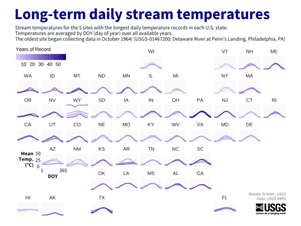
Timeseries: down/upwards - Long-term daily stream temperatures
Timeseries: down/upwards - Long-term daily stream temperaturesA tile map of the U.S. showing mean daily stream temperature for the 5 USGS stream sites with the longest daily temperature records in each U.S. state. The oldest site, in Philadelphia, Pennsylvania, began collecting data in October 1964.

Timeseries: down/upwards - Ocean currents cycle between warmer (el Niño) and cooler (la Niña) periods
Timeseries: down/upwards - Ocean currents cycle between warmer (el Niño) and cooler (la Niña) periodsA timeseries of monthly Oceanic Niño Index values from 1950 to 2023. The y-axis is mirrored at 0, with positive teal values indicating el Niño periods and negative lavender values corresponding to la Niña periods. The chart sits over a watercolor wash that has a gradient from teal at the top to lavender at the bottom.

Timeseries: correlation - Hysteresis (image 1)
A scatter plot of water temperature versus air temperature on April 27, 2019, for the Paine Run stream in Shenandoah National Park. Points are plotted for each 30-minute interval. Daytime points are hollow, while nighttime points are solid.
A scatter plot of water temperature versus air temperature on April 27, 2019, for the Paine Run stream in Shenandoah National Park. Points are plotted for each 30-minute interval. Daytime points are hollow, while nighttime points are solid.

Timeseries: correlation - Hysteresis (image 2)
Animation showing changes in stream temperature relative to air temperature over the course of a day. The animation begins at midnight, adding a point at each half-hour interval. After dawn, as air temperature starts warming, the stream warms more slowly than air, and water temperature lags behind air temperature.
Animation showing changes in stream temperature relative to air temperature over the course of a day. The animation begins at midnight, adding a point at each half-hour interval. After dawn, as air temperature starts warming, the stream warms more slowly than air, and water temperature lags behind air temperature.

Timeseries: Anthropocene - Grand Canyon Be Dammed
A heatmap of streamflow downstream from the Glen Canyon Dam at USGS gage 09402500 in the Grand Canyon.
A heatmap of streamflow downstream from the Glen Canyon Dam at USGS gage 09402500 in the Grand Canyon.

Relationships: network - Which stream order covers the most distance?
Relationships: network - Which stream order covers the most distance?A map of the Potomac River stream network is colored by Strahler stream order, where higher order represents a larger stream. Next to the map is a donut chart, showing that small headwater streams (order 1) make up 57% of the river network, by length. The first three orders of streams, together, make up 87% of the network by length.

Relationships: positive/negative - March 2023 relative snow covered area
Relationships: positive/negative - March 2023 relative snow covered areaA map of the contiguous U.S. using a snowflake hex pattern to show relative snow cover for March 2023 compared to 20-year average (2003 through 2022). Much of the western states experienced more snow than normal, such as the Rocky Mountains and the upper Great Plains. Much of the eastern U.S.
Science and Products
USGS Data in K-12 Education: Inspiring Future Scientists
Co-producing adaptable applications and trainings using USGS data to enhance data literacy in K-12 education.
Water Data Visualizations
Water data visualizations are provocative visuals and captivating stories that inform, inspire, and empower people to address our Nation's most pressing water issues. USGS data science and visualization experts use visualizations to communicate water data in compelling and often interactive ways when static images or written narrative can’t effectively communicate the interconnectivity and...
Filter Total Items: 44
Total water use (2010-2020)
Total water use for the top 3 water use categories: thermoelectric power generation, public supply, and crop irrigation. These three categories make up 90% of all water use in the contiguous United States.
Total water use for the top 3 water use categories: thermoelectric power generation, public supply, and crop irrigation. These three categories make up 90% of all water use in the contiguous United States.
U.S. River Conditions, October to December 2023
This is an animation showing the changing conditions relative to the historic record of USGS streamgages from October 1, 2023 to December 31, 2023. The river conditions shown range from the driest condition seen at a gage (red open circles) to the wettest (blue closed circles). A purple outer ring around a gage indicates it is flooding.
This is an animation showing the changing conditions relative to the historic record of USGS streamgages from October 1, 2023 to December 31, 2023. The river conditions shown range from the driest condition seen at a gage (red open circles) to the wettest (blue closed circles). A purple outer ring around a gage indicates it is flooding.
U.S. River Conditions, July to September 2023
This is an animation showing the changing conditions relative to the historic record of USGS streamgages from July 1, 2023 to September 30, 2023. The river conditions shown range from the driest condition seen at a gage (red open circles) to the wettest (blue closed circles). A purple outer ring around a gage indicates it is flooding.
This is an animation showing the changing conditions relative to the historic record of USGS streamgages from July 1, 2023 to September 30, 2023. The river conditions shown range from the driest condition seen at a gage (red open circles) to the wettest (blue closed circles). A purple outer ring around a gage indicates it is flooding.
U.S. River Conditions, April to June 2023
This is an animation showing the changing conditions relative to the historic record of USGS streamgages from April 1, 2023 to June 30, 2023. The river conditions shown range from the driest condition seen at a gage (red open circles) to the wettest (blue closed circles). A purple outer ring around a gage indicates it is flooding.
This is an animation showing the changing conditions relative to the historic record of USGS streamgages from April 1, 2023 to June 30, 2023. The river conditions shown range from the driest condition seen at a gage (red open circles) to the wettest (blue closed circles). A purple outer ring around a gage indicates it is flooding.
Relationships: new tool - Split-panel map for inspecting timeseries images of Landsat and NLCD from 2001-2016 for Great Salt Lake
Relationships: new tool - Split-panel map for inspecting timeseries images of Landsat and NLCD from 2001-2016 for Great Salt LakeA split-panel map of Salt Lake City, Utah, highlighting the Great Salt Lake, shows 2006 Landsat imagery on the left side panel and 2006 NLCD, with colorized legend of land use classes, on the right. The animation displays a slider being used to switch between the two different datasets, revealing the land cover classes shown in Landsat imagery.
Uncertainties: data day - Annual freshwater withdrawals in the United States (1990-2019)
Uncertainties: data day - Annual freshwater withdrawals in the United States (1990-2019)Stacked bar chart of 1990-2019 agriculture, domestic, and industry freshwater withdrawals in the U.S., estimated by the World Bank. In all years, industry withdraws the most freshwater, followed by agriculture and domestic. From 2006 to 2010, industrial water dropped 5,000 cubic kilometers, then remained low.
Uncertainties: monochrome - Estimating streamflow from satellites
Uncertainties: monochrome - Estimating streamflow from satellitesAnimation of five satellite images of the Tanana River in Alaska. The imagery is colored in shades of blue to show the degree of confidence that water is present. Two scatter plots show positive pairwise relationships between satellite river elevation and satellite river width and satellite streamflow.
Uncertainties: trend - Maximum percent ice cover in the Great Lakes: Difference from 50-year mean (1973-2023)
Uncertainties: trend - Maximum percent ice cover in the Great Lakes: Difference from 50-year mean (1973-2023)Six lollipop charts highlight deviations in maximum percent ice cover on the five Great Lakes (Lake Michigan, Lake Erie, Lake Superior, Lake Huron, and Lake Ontario) from 1973-2023. The difference in lake ice cover is shown for each lake and across the entire system compared to the 50-year mean (1973-2023).
Uncertainties: trend - Change in forest area compared to 35-year mean (1985-2020)
Uncertainties: trend - Change in forest area compared to 35-year mean (1985-2020)A tile map of the U.S. with lollipop charts for each state that show differences in forest area magnitude, in squared kilometers, from the 35-year mean (1985-2020) across the contiguous United States (CONUS). Positive differences are shown in forest green lollipops and negative differences are shown in burnt orange lollipops.
Uncertainties: local change - How will climate change affect the timing of fish spawning? (image 2)
Uncertainties: local change - How will climate change affect the timing of fish spawning? (image 2)Circular calendar charts showing the projected effects of climate change on the onset and end of spawning for the American Shad and the Striped Bass in the Hudson River Estuary, during two modeling periods: 1950 to 2012 and 2012 to 2099.
Uncertainties: local change - How will climate change affect the timing of fish spawning? (image 1)
Uncertainties: local change - How will climate change affect the timing of fish spawning? (image 1)Circular calendar charts showing the projected effects of climate change on the onset and end of spawning for the American Shad and the Striped Bass in the Hudson River Estuary, during two modeling periods: 1950 to 2012 and 2012 to 2099.
Uncertainties: global change - The loss of the North American grassland biome
Uncertainties: global change - The loss of the North American grassland biomeThe loss of the North American grassland biome. Once spanning more than 2 million square kilometers, we have lost over half of the world’s most imperiled ecosystem: the temperate grasslands. A map of North America shows the loss of the grassland biome from Canada to Mexico, largely contained within the central plains of North America.
Timeseries: tiles - Changes in U.S. water use from 1985 to 2015
Timeseries: tiles - Changes in U.S. water use from 1985 to 2015A tile map of the U.S. with alluvial charts for each state and the nation that show changes in the total volume of water use from 1985-2015 across eight categories (thermoelectric, irrigation, public supply, industrial, aquaculture, mining, domestic, and livestock).
Timeseries: green energy - Electricity generated by renewable energy in the U.S.
Timeseries: green energy - Electricity generated by renewable energy in the U.S.Step chart timeseries of U.S. electricity generation (in gigawatt hours) across five classes of renewable energy, from 2000 to 2020. As of 2020, these classes ranked (from high to low): wind, hydropower, solar, bioenergy, and geothermal. From 2000 to 2020, wind power generation steadily grew from roughly 10,000 to over 325,000 gigawatt hours.
Timeseries: down/upwards - Long-term daily stream temperatures
Timeseries: down/upwards - Long-term daily stream temperaturesA tile map of the U.S. showing mean daily stream temperature for the 5 USGS stream sites with the longest daily temperature records in each U.S. state. The oldest site, in Philadelphia, Pennsylvania, began collecting data in October 1964.
Timeseries: down/upwards - Ocean currents cycle between warmer (el Niño) and cooler (la Niña) periods
Timeseries: down/upwards - Ocean currents cycle between warmer (el Niño) and cooler (la Niña) periodsA timeseries of monthly Oceanic Niño Index values from 1950 to 2023. The y-axis is mirrored at 0, with positive teal values indicating el Niño periods and negative lavender values corresponding to la Niña periods. The chart sits over a watercolor wash that has a gradient from teal at the top to lavender at the bottom.
Timeseries: correlation - Hysteresis (image 1)
A scatter plot of water temperature versus air temperature on April 27, 2019, for the Paine Run stream in Shenandoah National Park. Points are plotted for each 30-minute interval. Daytime points are hollow, while nighttime points are solid.
A scatter plot of water temperature versus air temperature on April 27, 2019, for the Paine Run stream in Shenandoah National Park. Points are plotted for each 30-minute interval. Daytime points are hollow, while nighttime points are solid.
Timeseries: correlation - Hysteresis (image 2)
Animation showing changes in stream temperature relative to air temperature over the course of a day. The animation begins at midnight, adding a point at each half-hour interval. After dawn, as air temperature starts warming, the stream warms more slowly than air, and water temperature lags behind air temperature.
Animation showing changes in stream temperature relative to air temperature over the course of a day. The animation begins at midnight, adding a point at each half-hour interval. After dawn, as air temperature starts warming, the stream warms more slowly than air, and water temperature lags behind air temperature.
Timeseries: Anthropocene - Grand Canyon Be Dammed
A heatmap of streamflow downstream from the Glen Canyon Dam at USGS gage 09402500 in the Grand Canyon.
A heatmap of streamflow downstream from the Glen Canyon Dam at USGS gage 09402500 in the Grand Canyon.
Relationships: network - Which stream order covers the most distance?
Relationships: network - Which stream order covers the most distance?A map of the Potomac River stream network is colored by Strahler stream order, where higher order represents a larger stream. Next to the map is a donut chart, showing that small headwater streams (order 1) make up 57% of the river network, by length. The first three orders of streams, together, make up 87% of the network by length.
Relationships: positive/negative - March 2023 relative snow covered area
Relationships: positive/negative - March 2023 relative snow covered areaA map of the contiguous U.S. using a snowflake hex pattern to show relative snow cover for March 2023 compared to 20-year average (2003 through 2022). Much of the western states experienced more snow than normal, such as the Rocky Mountains and the upper Great Plains. Much of the eastern U.S.