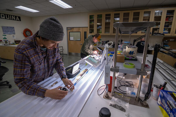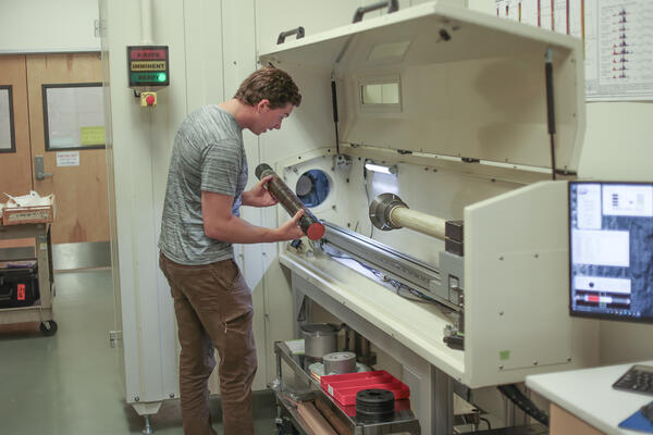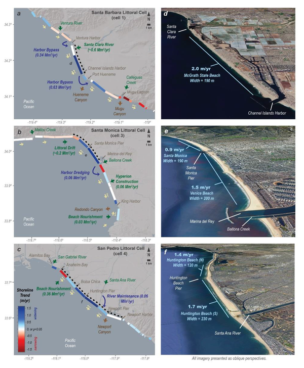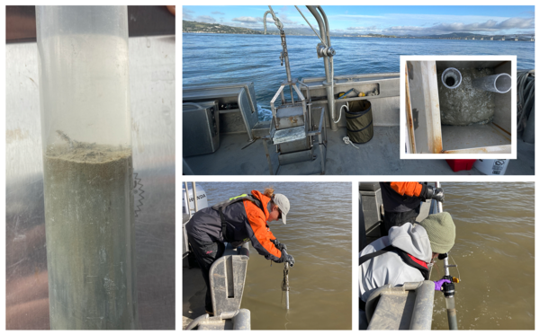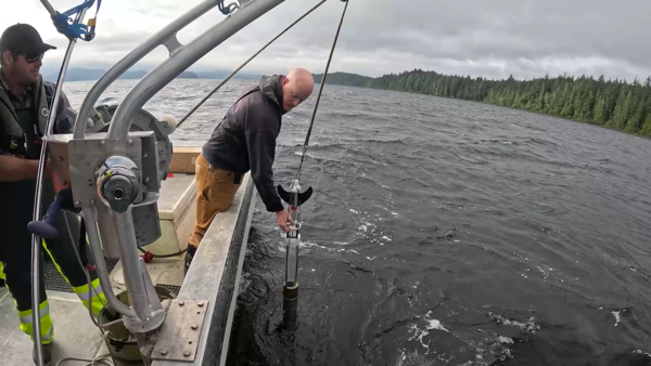
Scientists separating a sediment core split lengthwise_3
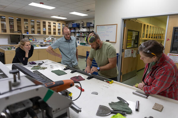
Scientists separating a sediment core split lengthwise_3USGS scientists collect core samples from estuaries, lakes, coasts, and marine environments to study a range of physical and chemical properties preserved in sediments over time. They process and analyze these core samples in the Pacific Coastal and Marine Science Center’s Core Labs.