Wading River flooding after a massive winter storm
Wading River flooding after a massive winter stormFlooded front yard of a house near the Wading River after a massive winter storm in January 2024.

Official websites use .gov
A .gov website belongs to an official government organization in the United States.
Secure .gov websites use HTTPS
A lock () or https:// means you’ve safely connected to the .gov website. Share sensitive information only on official, secure websites.
Explore water-related photography, imagery, and illustrations.
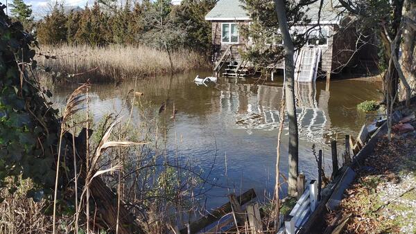
Flooded front yard of a house near the Wading River after a massive winter storm in January 2024.
Flooded front yard of a house near the Wading River after a massive winter storm in January 2024.
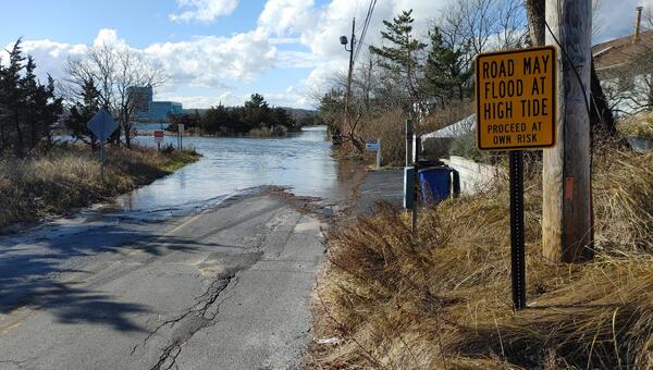
Flooding after the winter storm of January 12th, 2024, in Wading River along Creek Road and Sound Road.
Flooding after the winter storm of January 12th, 2024, in Wading River along Creek Road and Sound Road.

Screenshot of the StreamStats Batch Processing Tool user interface. This tool produces shapefiles that contain the delineated basins, basin characteristics, and flow statistics for multiple sites requested at once by users.
Screenshot of the StreamStats Batch Processing Tool user interface. This tool produces shapefiles that contain the delineated basins, basin characteristics, and flow statistics for multiple sites requested at once by users.

A tile map of the US showing streamgages by flow levels through the month of December 2023. For each state, an area chart shows the proportion of streamgages in wet, normal, or dry conditions. Streamflow conditions are quantified using percentiles comparing the past month’s flow levels to the historic record for each streamgage.
A tile map of the US showing streamgages by flow levels through the month of December 2023. For each state, an area chart shows the proportion of streamgages in wet, normal, or dry conditions. Streamflow conditions are quantified using percentiles comparing the past month’s flow levels to the historic record for each streamgage.

Photograph of the Lake in Central Park, NY under harmful algal bloom conditions.
Photograph of the Lake in Central Park, NY under harmful algal bloom conditions.

Photo of green forested area and blue sky overlooking the ocean in Kahanahāiki, Oʻahu on a sunny day.
Photo of green forested area and blue sky overlooking the ocean in Kahanahāiki, Oʻahu on a sunny day.
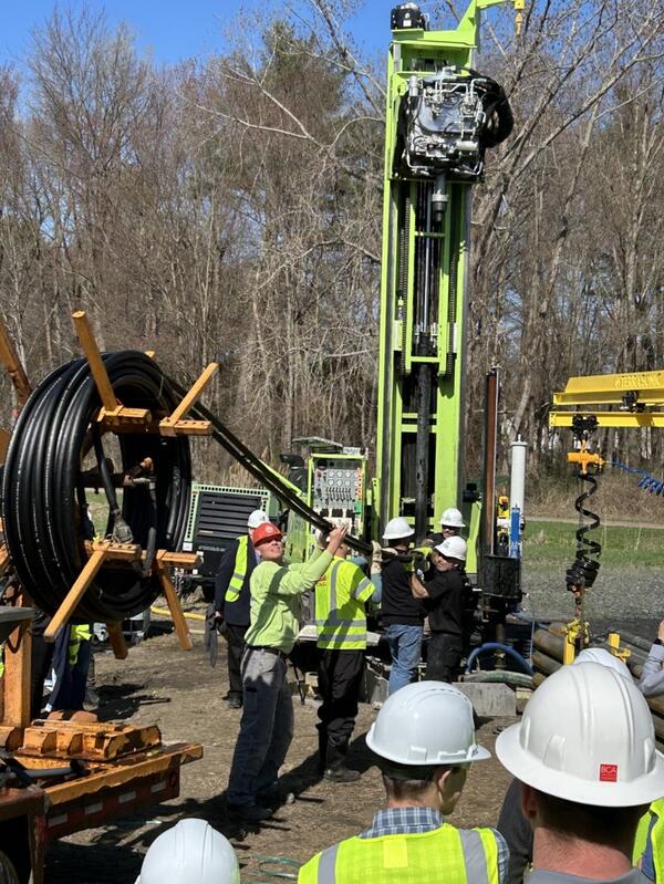
Installation of a closed loop geothermal system near Saratoga Springs, New York by a team of USGS scientists and other experts.
Installation of a closed loop geothermal system near Saratoga Springs, New York by a team of USGS scientists and other experts.
The image is the logo for pywatershed created by James L. Mccreight. jmccreight@usgs.gov
The image is the logo for pywatershed created by James L. Mccreight. jmccreight@usgs.gov

Photo of a lush green forested area around Makamaka‘ole Stream near Kānoa Ridge, Maui.
Photo of a lush green forested area around Makamaka‘ole Stream near Kānoa Ridge, Maui.

Photo of lush green forested area around Makamaka‘ole Stream near Kānoa Ridge, Maui.
Photo of lush green forested area around Makamaka‘ole Stream near Kānoa Ridge, Maui.

Cloud covered forest landscape in Nakula, Maui with outlines of trees in the distance.
Cloud covered forest landscape in Nakula, Maui with outlines of trees in the distance.

Freshwater waterfall in lush green forested area named Wailua Iki Falls, Maui.
Freshwater waterfall in lush green forested area named Wailua Iki Falls, Maui.

Salt deposits along the Paria River, UT. USGS scientists are studying salinity in the Upper Colorado Basin.
Salt deposits along the Paria River, UT. USGS scientists are studying salinity in the Upper Colorado Basin.

The Dolores River, CO, a tributary of the Colorado River. USGS scientists are studying salinity in the Upper Colorado Basin.
The Dolores River, CO, a tributary of the Colorado River. USGS scientists are studying salinity in the Upper Colorado Basin.

A Hydrologic Imagery Visualization and Information System (HIVIS) camera along the San Antonio River in San Antonio, Texas. The camera is used to verify the position of a gate that is operated by the City of San Antonio. Check out the camera here.
A Hydrologic Imagery Visualization and Information System (HIVIS) camera along the San Antonio River in San Antonio, Texas. The camera is used to verify the position of a gate that is operated by the City of San Antonio. Check out the camera here.

A soil moisture data logger buried in the ground is a specialized instrument designed to measure and record the moisture content of soil over time. Here's how it generally functions:
A soil moisture data logger buried in the ground is a specialized instrument designed to measure and record the moisture content of soil over time. Here's how it generally functions:

*English is the official language and authoritative version of all federal information
*English is the official language and authoritative version of all federal information

This diagram, released in English and Spanish in 2022, depicts the global water cycle. It shows how human water use affects where water is stored, how it moves, and how clean it is. This diagram is also available in other languages available on our Downloadable Products page.
This diagram, released in English and Spanish in 2022, depicts the global water cycle. It shows how human water use affects where water is stored, how it moves, and how clean it is. This diagram is also available in other languages available on our Downloadable Products page.

The USGS National Water Quality Program (NWQP) is funding 24 projects in 15 geographic areas that advance real-time monitoring, remote sensing, and use of molecular techniques in identifying and predicting the occurrence of HABs and the toxins they produce.
The USGS National Water Quality Program (NWQP) is funding 24 projects in 15 geographic areas that advance real-time monitoring, remote sensing, and use of molecular techniques in identifying and predicting the occurrence of HABs and the toxins they produce.

March-August daily average streamflow for the last 30 years (1991-2022) (dark gray lines) compared to 2023, showing the periods where 2023 streamflow was above (blue) and below (orange) the historical average. Individual years of the relevant historical streamflow period are shown in light gray.
March-August daily average streamflow for the last 30 years (1991-2022) (dark gray lines) compared to 2023, showing the periods where 2023 streamflow was above (blue) and below (orange) the historical average. Individual years of the relevant historical streamflow period are shown in light gray.

Map of the Integrated Water Science study area for the Willamette River Basin, Oregon.
Map of the Integrated Water Science study area for the Willamette River Basin, Oregon.