Abandoned cars on a flooded street in Brooklyn, NY.
Abandoned cars on a flooded street in Brooklyn, NY.Abandoned cars on a flooded street in the Gowanus neighborhood of Brooklyn, NY during a storm in 2023.


Official websites use .gov
A .gov website belongs to an official government organization in the United States.

Secure .gov websites use HTTPS
A lock () or https:// means you’ve safely connected to the .gov website. Share sensitive information only on official, secure websites.

Explore water-related photography, imagery, and illustrations.
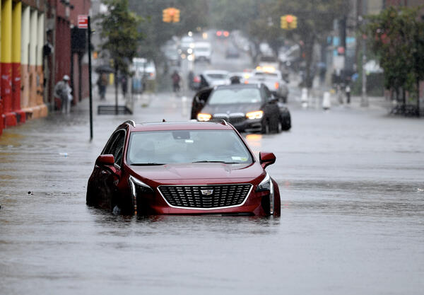
Abandoned cars on a flooded street in the Gowanus neighborhood of Brooklyn, NY during a storm in 2023.
Abandoned cars on a flooded street in the Gowanus neighborhood of Brooklyn, NY during a storm in 2023.
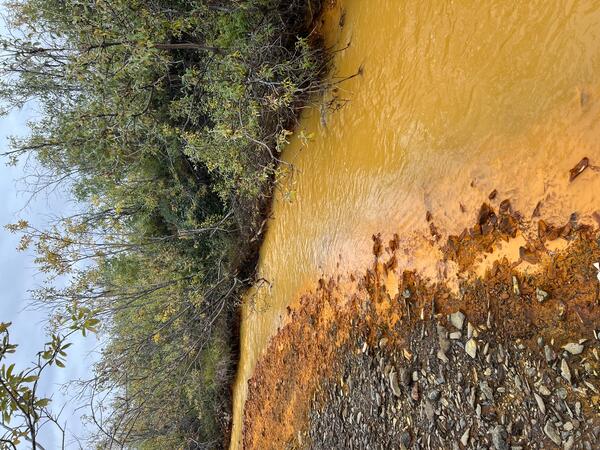
Orange streams are increasingly common in the Brooks Range of northern Alaska. The orange stream color reflects oxidized iron, but also often indicates elevated heavy metal concentrations. Our ongoing study aims to document these occurrences and the timing of their onset.
Orange streams are increasingly common in the Brooks Range of northern Alaska. The orange stream color reflects oxidized iron, but also often indicates elevated heavy metal concentrations. Our ongoing study aims to document these occurrences and the timing of their onset.

Vegetation growth is assisting the Muddy Creek channel in becoming deeper and narrower (Carbon County, Wyoming). Photo by Patrick Anderson (USGS)
Vegetation growth is assisting the Muddy Creek channel in becoming deeper and narrower (Carbon County, Wyoming). Photo by Patrick Anderson (USGS)

This is a screenshot taken from a timelapse video of a rising glacial lake from May through August 2023. The video was captured by a USGS Hydrologic Imagery Visualization and Information System (HIVIS) camera. The water level in the lake gradually rises throughout the video and then the water level dramatically decreases towards the end of the video.
This is a screenshot taken from a timelapse video of a rising glacial lake from May through August 2023. The video was captured by a USGS Hydrologic Imagery Visualization and Information System (HIVIS) camera. The water level in the lake gradually rises throughout the video and then the water level dramatically decreases towards the end of the video.

Orange streams are increasingly common in the Brooks Range of northern Alaska. The orange stream color reflects oxidized iron, but also often indicates elevated heavy metal concentrations. Our ongoing study aims to document these occurrences and the timing of their onset.
Orange streams are increasingly common in the Brooks Range of northern Alaska. The orange stream color reflects oxidized iron, but also often indicates elevated heavy metal concentrations. Our ongoing study aims to document these occurrences and the timing of their onset.

Orange streams are increasingly common in the Brooks Range of northern Alaska. The orange stream color reflects oxidized iron, but also often indicates elevated heavy metal concentrations. Our ongoing study aims to document these occurrences and the timing of their onset.
Orange streams are increasingly common in the Brooks Range of northern Alaska. The orange stream color reflects oxidized iron, but also often indicates elevated heavy metal concentrations. Our ongoing study aims to document these occurrences and the timing of their onset.

U.S. River Conditions, April to June 2023 visualization thumbnail image. For more visualizations, check out https://labs.waterdata.usgs.gov/visualizations/vizlab-home/index.html#/
U.S. River Conditions, April to June 2023 visualization thumbnail image. For more visualizations, check out https://labs.waterdata.usgs.gov/visualizations/vizlab-home/index.html#/
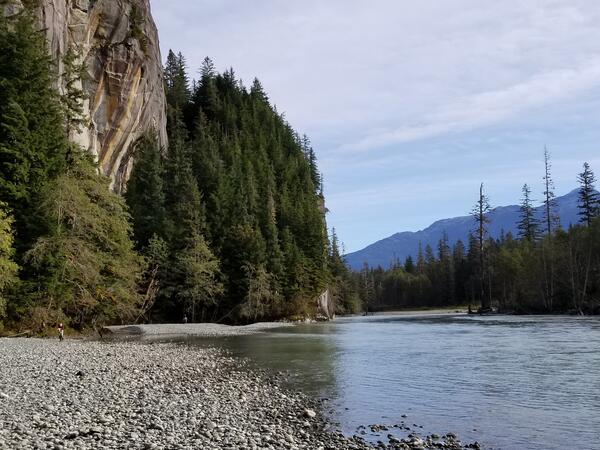
USGS Staff at the Unuk River Streamgage in Southeast Alaska. The Unuk River is the second smallest watershed in the transboundary study of Southeast Alaska, but has three large mining projects in development (Kerr-Sulplherets-Mitchell (KSM), Brucejack, and Eskay Creek)
USGS Staff at the Unuk River Streamgage in Southeast Alaska. The Unuk River is the second smallest watershed in the transboundary study of Southeast Alaska, but has three large mining projects in development (Kerr-Sulplherets-Mitchell (KSM), Brucejack, and Eskay Creek)
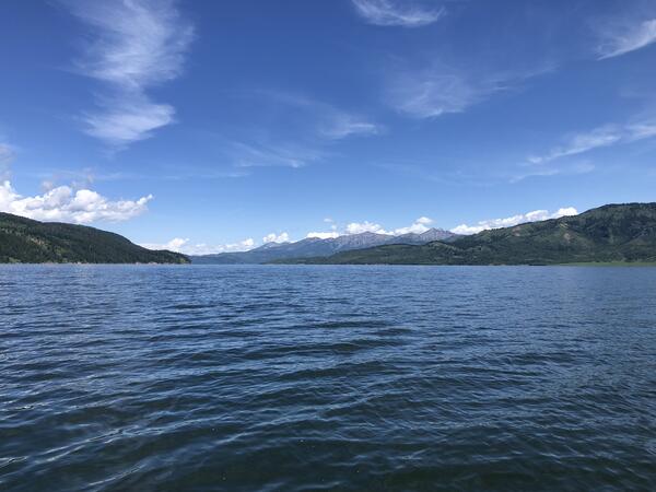
View of Palisades Reservoir, on the Idaho-Wyoming border. This waterbody was included in a state-wide effort to validate satellite remote sensing of water quality.
View of Palisades Reservoir, on the Idaho-Wyoming border. This waterbody was included in a state-wide effort to validate satellite remote sensing of water quality.
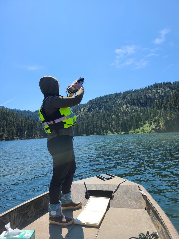
Validating satellite observations of water quality includes measuring the incident lighting conditions. Here solar radiation is measured with a spectral radiometer on Fernan Lake, Idaho.
Validating satellite observations of water quality includes measuring the incident lighting conditions. Here solar radiation is measured with a spectral radiometer on Fernan Lake, Idaho.
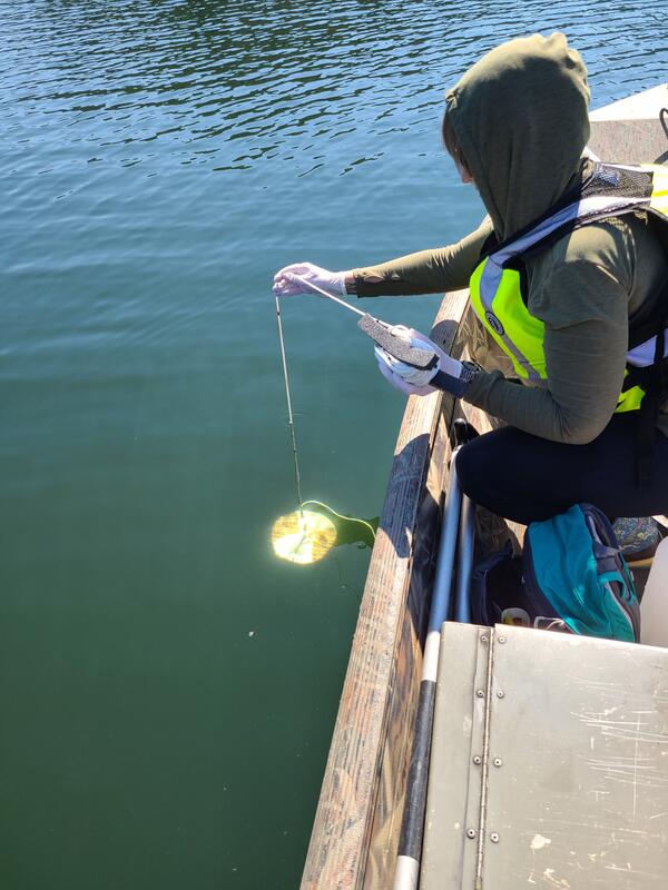
Water clarity, a fundamental measure of water quality, is measured using a standard sized “Secchi” disk that is lowered until it is no longer visible. Measurements like this from Lake Fernan, Idaho, are used to validate satellite remote sensing estimates of water quality.
Water clarity, a fundamental measure of water quality, is measured using a standard sized “Secchi” disk that is lowered until it is no longer visible. Measurements like this from Lake Fernan, Idaho, are used to validate satellite remote sensing estimates of water quality.

Lake Abert, Oregon is one of the 20 terminal lakes identified by USGS partners as priority ecosystems for study by the Saline Lakes Ecosystems IWAA.
Lake Abert, Oregon is one of the 20 terminal lakes identified by USGS partners as priority ecosystems for study by the Saline Lakes Ecosystems IWAA.

The Saline Lake Ecosystems IWAA Waterbird Movement Project began tagging American Avocets in March 2023 to track their movements across the landscape. Tracking data from these birds will help scientists better understand why these birds choose to use the terminal lake and wetland habitats they do in the Great Basin.
The Saline Lake Ecosystems IWAA Waterbird Movement Project began tagging American Avocets in March 2023 to track their movements across the landscape. Tracking data from these birds will help scientists better understand why these birds choose to use the terminal lake and wetland habitats they do in the Great Basin.
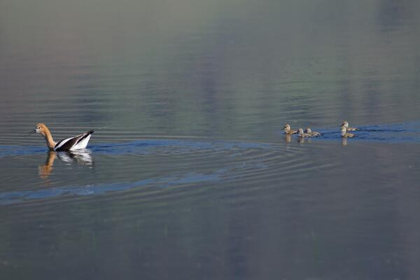
American Avocet are a bird that relies heavily on the Saline Lakes ecosystem during their spring migration periods. Over 50% of these birds exist here. Part of their use includes using the terminal lakes there to breed.
American Avocet are a bird that relies heavily on the Saline Lakes ecosystem during their spring migration periods. Over 50% of these birds exist here. Part of their use includes using the terminal lakes there to breed.

The USGS Water Resources Mission Area will assess water availability based on these core components of water supply and demand.
The USGS Water Resources Mission Area will assess water availability based on these core components of water supply and demand.

Physical Scientist Molly Huber of the Florence Bascom Geoscience Center examines tree roots in a location where a root cookie was recently cut.
Molly was there as part of a stream habitat/riparian assessment at Orson Creek in south central Pennsylvania.
Physical Scientist Molly Huber of the Florence Bascom Geoscience Center examines tree roots in a location where a root cookie was recently cut.
Molly was there as part of a stream habitat/riparian assessment at Orson Creek in south central Pennsylvania.

#RecreateWithUSGS is a national photo contest to raise awareness of the importance of USGS water data collected on public lands where people recreate in, on, and around water. Participate in this national photo contest and share your photo with us. Post on Instagram using #RecreateWithUSGS and tag @USGS_Water. The contest is open from June 12th - August 20th, 2023.
#RecreateWithUSGS is a national photo contest to raise awareness of the importance of USGS water data collected on public lands where people recreate in, on, and around water. Participate in this national photo contest and share your photo with us. Post on Instagram using #RecreateWithUSGS and tag @USGS_Water. The contest is open from June 12th - August 20th, 2023.

Orange streams are increasingly common in the Brooks Range of northern Alaska. The orange stream color reflects oxidized iron, but also often indicates elevated heavy metal concentrations. Our ongoing study aims to document these occurrences and the timing of their onset.
Orange streams are increasingly common in the Brooks Range of northern Alaska. The orange stream color reflects oxidized iron, but also often indicates elevated heavy metal concentrations. Our ongoing study aims to document these occurrences and the timing of their onset.

Orange streams are increasingly common in the Brooks Range of northern Alaska. The orange stream color reflects oxidized iron, but also often indicates elevated heavy metal concentrations. Our ongoing study aims to document these occurrences and the timing of their onset.
Orange streams are increasingly common in the Brooks Range of northern Alaska. The orange stream color reflects oxidized iron, but also often indicates elevated heavy metal concentrations. Our ongoing study aims to document these occurrences and the timing of their onset.

Orange streams are increasingly common in the Brooks Range of northern Alaska. The orange stream color reflects oxidized iron, but also often indicates elevated heavy metal concentrations. Our ongoing study aims to document these occurrences and the timing of their onset.
Orange streams are increasingly common in the Brooks Range of northern Alaska. The orange stream color reflects oxidized iron, but also often indicates elevated heavy metal concentrations. Our ongoing study aims to document these occurrences and the timing of their onset.

Photo of Blake Dudding, USGS, performing a survey on the banks of Lake Anna, Virginia
Photo of Blake Dudding, USGS, performing a survey on the banks of Lake Anna, Virginia